
3D/2D animations
Overview of Magazine answer


Design principles used while designing
Visual Hierarchy
Content organization
Multimedia integration
Consistency
Accessibility
User problems
ADITYA- THE CODER
Works at a mid-sized tech company where he juggles multiple projects, including web and mobile app development. He often finds himself troubleshooting issues and seeking efficient solutions to integrate into his work.
PAIN POINTS
Wasting time switching between multiple tabs and resources.
Difficulty finding the most relevant and up-to-date information.
Lack of integrated, multimedia content that can make learning and problem-solving more engaging.
Inconsistent quality of information across different platforms.
Beginner
These are people who have little or no prior experience in coding and want to learn the basics.
Pain point - Application gap, directionless, concept blindness
INTERMEDIATE
A developer in a reputed firm and has been working on the frontend of the system for 1 year or so.
Need - Enhance skills, learn frameworks, up to date with trend
ADVANCED
A developer with 8 years of work experience. His work now involves more solution, designing and architecting software systems.
Pain points - Information retrieval, technological lag
KEY PROBLEMS
Tab Switching
Low Discoverability
Lack of Multimedia
#1 Tab Switching
PROBLEM STATEMENT
Developers waste valuable time toggling between multiple tabs to find relevant information. This inefficiency hinders productivity and disrupts the workflow.
SOLUTION
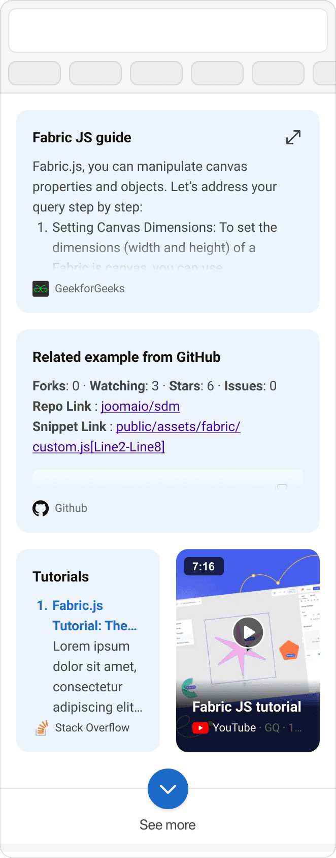
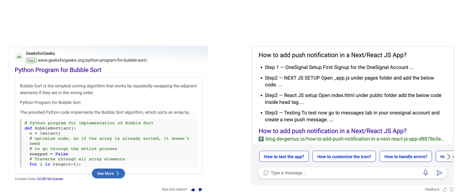
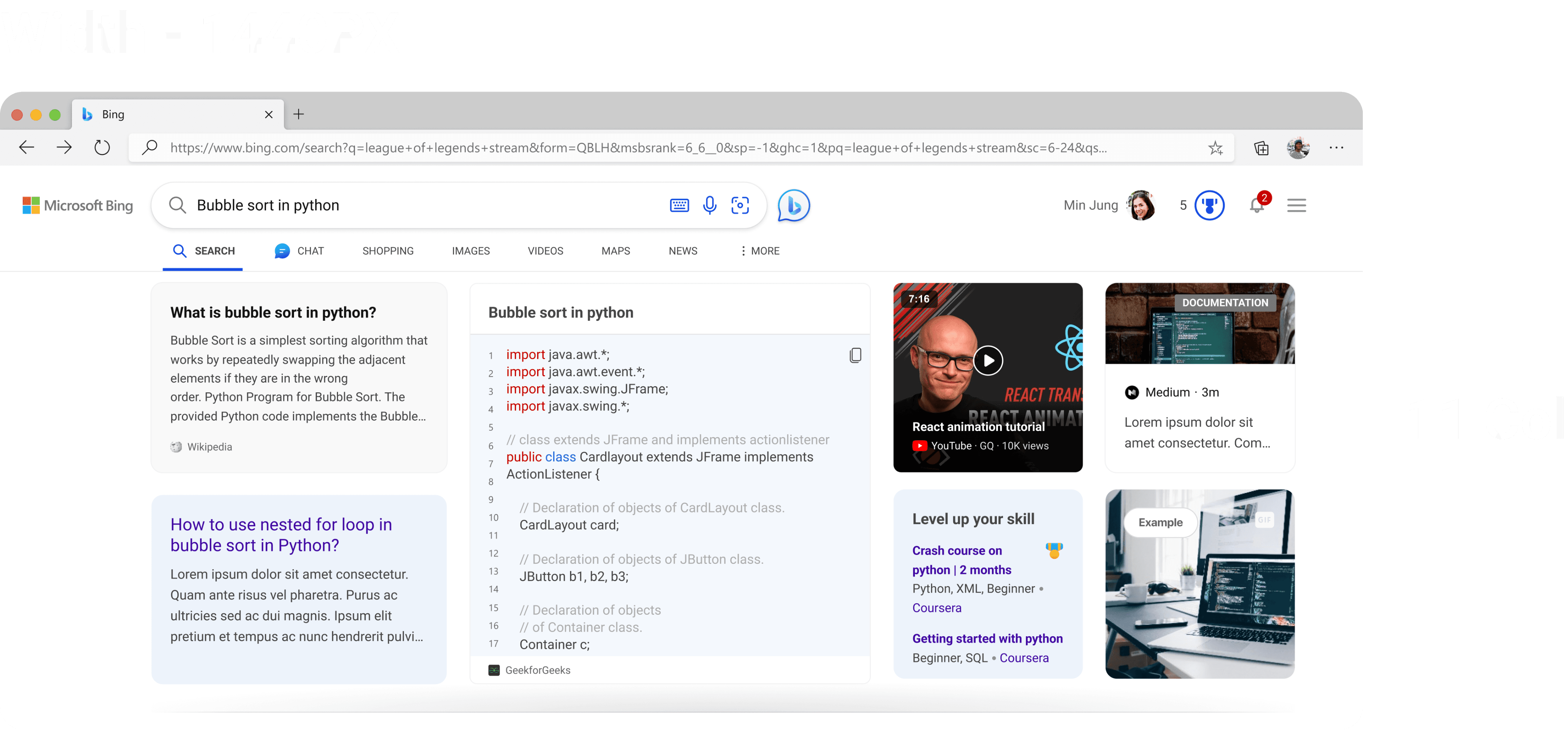
Magazine Answer
Magazine answer showcase multiple intent answer in one place.
It can be code snippet, github repo, video tutorials, documentation etc.
It fullfills multiple user intent need without searching for it separately.
It works on modular based modules where it can dynamically fill space and move around the content.
#2 Low Discoverability
PROBLEM STATEMENT
Valuable developer resources are buried behind multiple platforms, making it difficult for users to find relevant information efficiently. This lack of discoverability leads to frustration and reduced productivity.
SOLUTION
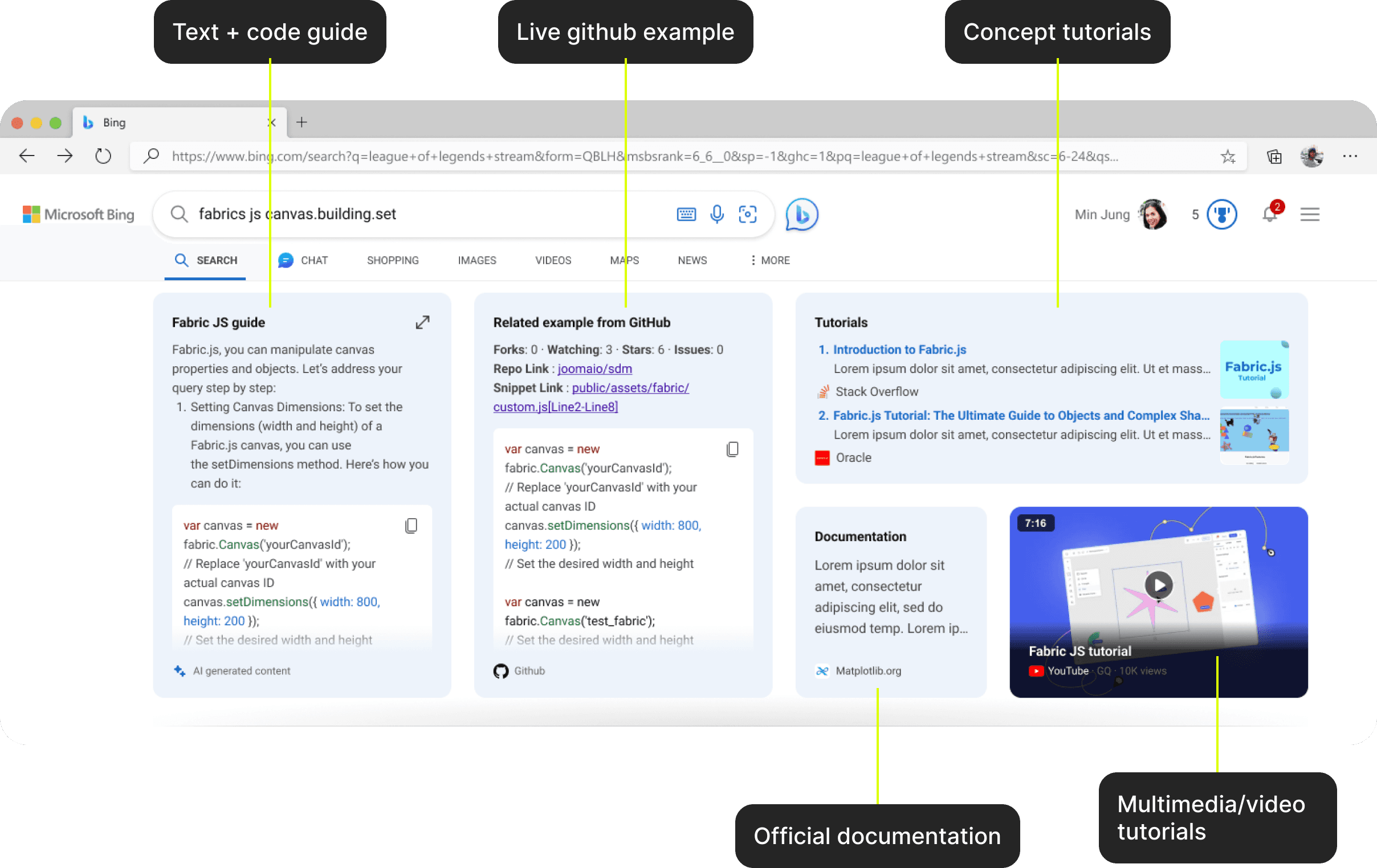
Varieties of Modules at one place
All necessary modules that can help resolve your query in one place. No need to search in new tab for other intent.

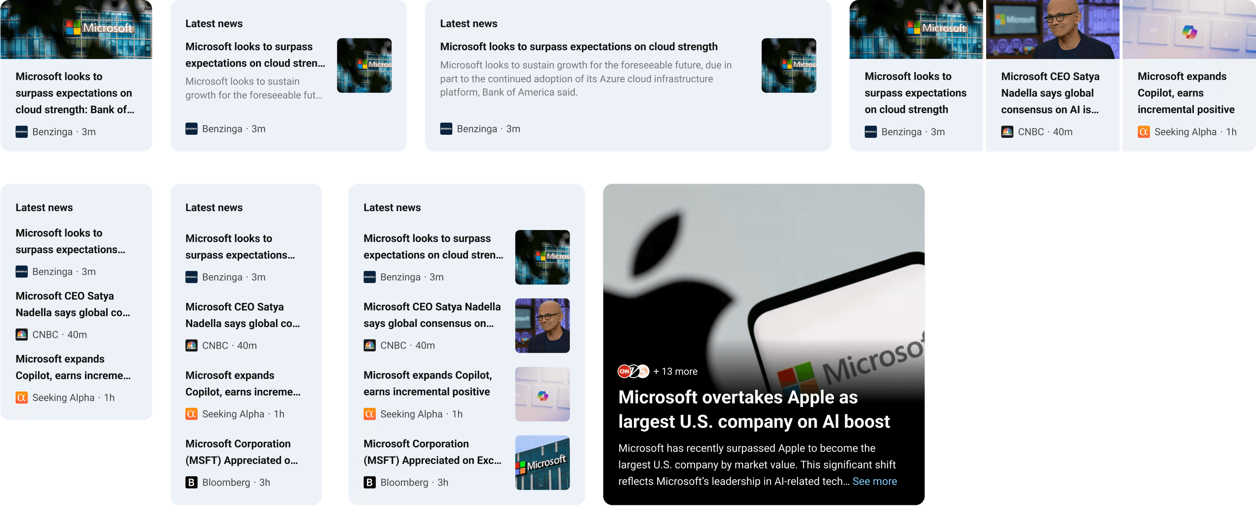
Latest news module
Get up to date in market trends and news around your topic.
#3 Lack of Multimedia
PROBLEM STATEMENT
Developer resources often lack engaging multimedia elements like videos and interactive tutorials, making it harder for users to fully grasp complex concepts. This limitation reduces the overall learning experience and user engagement.
SOLUTION
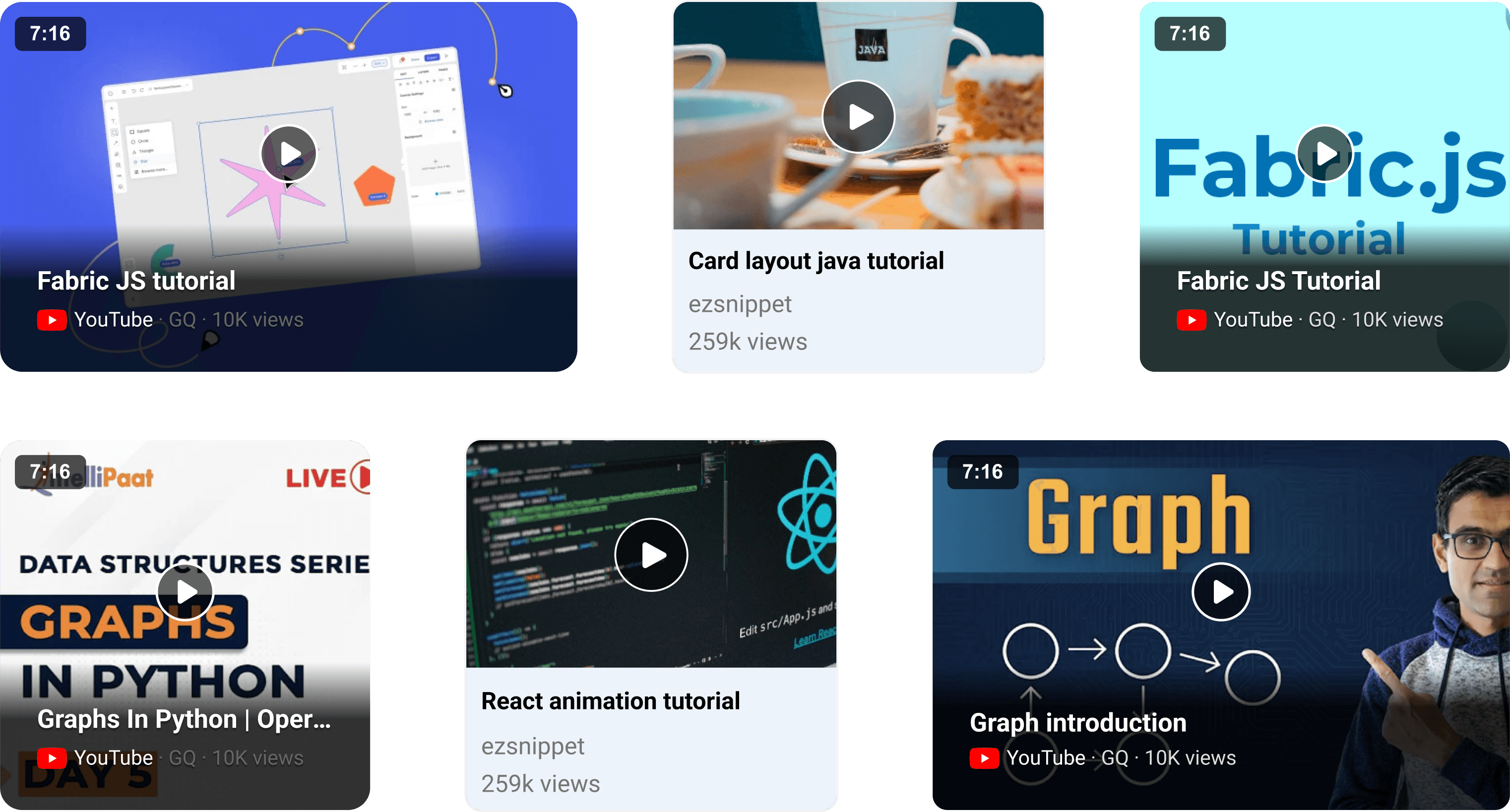
Video tutorials
Top video tutorials from top channels explaining your concept
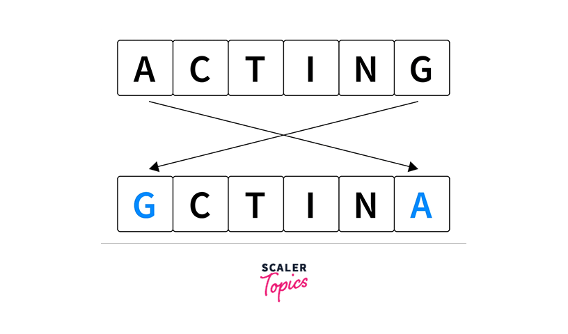
Concept autoplay GIFs
Concept explanation via gifs.
Here gif one showing bubble sort in python concept and how it works.
Gif 2 showing string concept in C++.
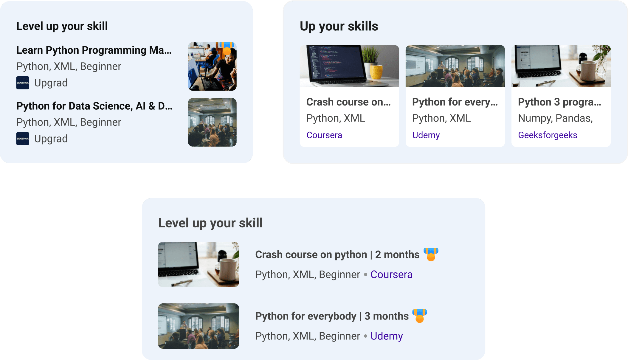
Upskill
Based on your query, upskill module will recommend you related courses you can opt in for better understanding of topics from top platforms.
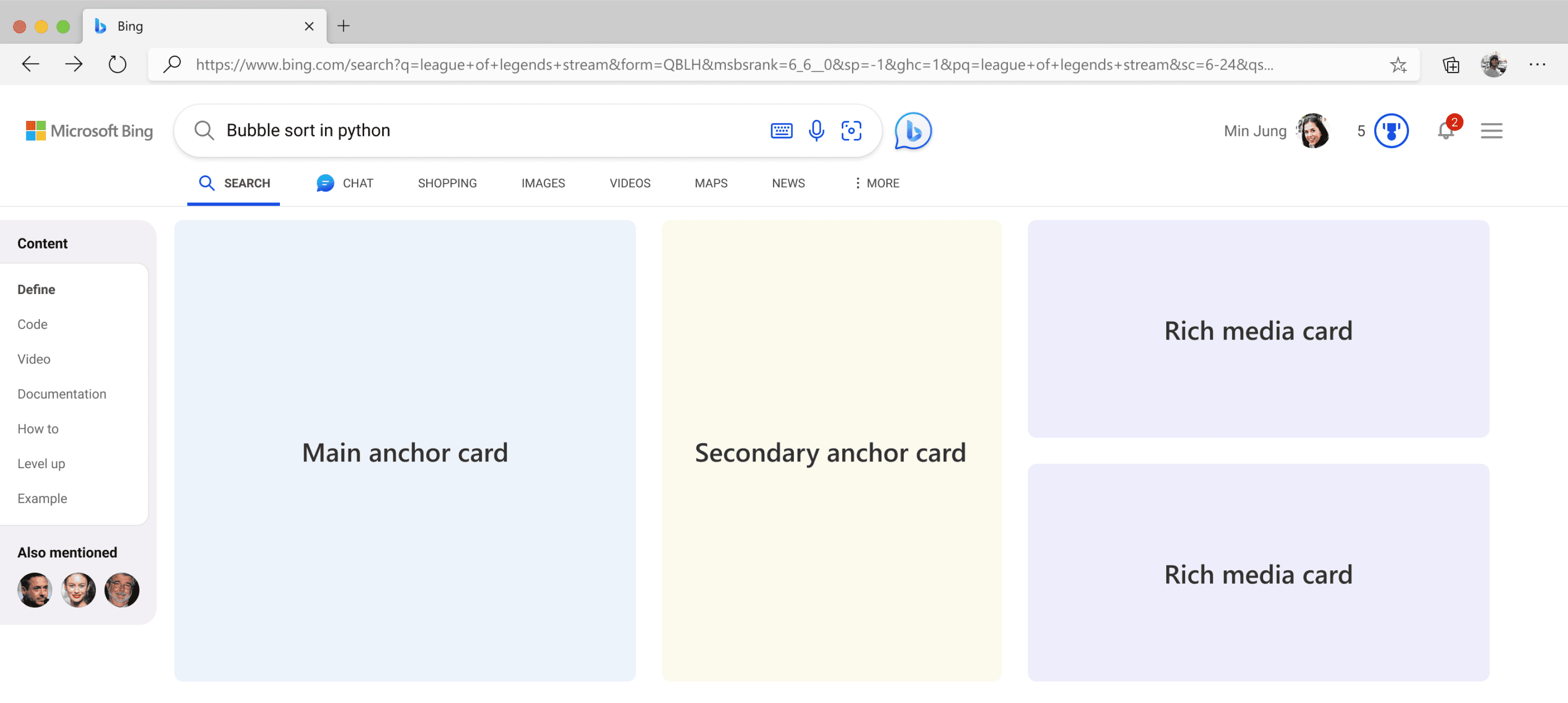
UI Block Architecture
Layout 1
Pros
Clear intent and focuses better.
Better readability pattern.
Keeping richer media on one side keeps the design language also consistent.
Cons
Less variety of modules.
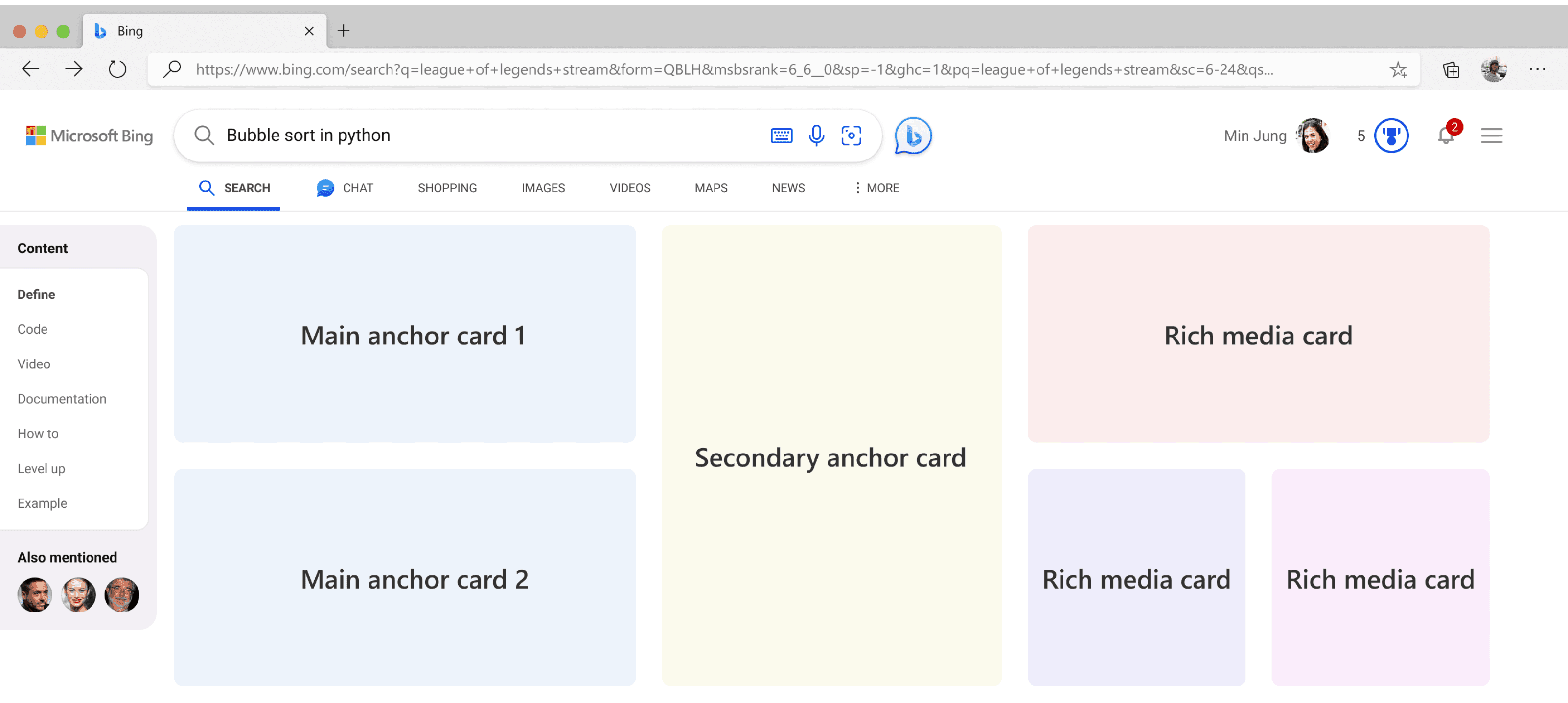
Layout 2
Pros
Can showcase multiple high intent modules.
Multiple rich media content like tutorial, blogs and documentation can be showcased
Cons
Limited module visibility.
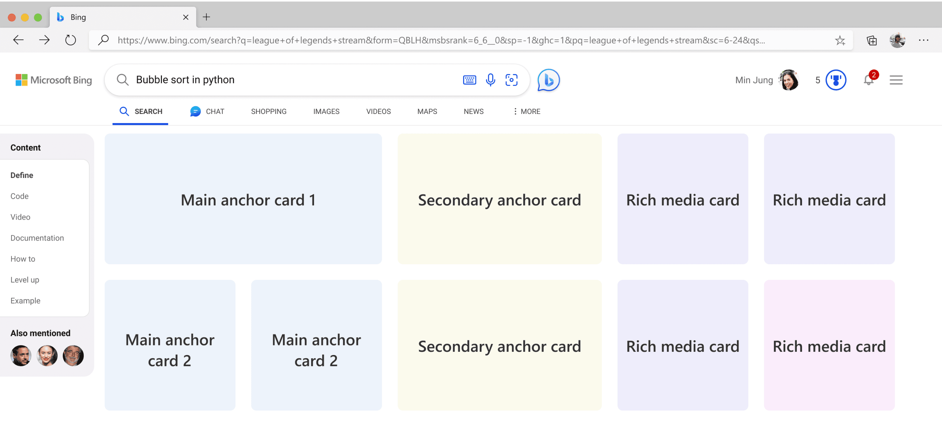
Layout 3
Pros
Can showcase multiple high intent modules.
Multiple rich media content like tutorial, blogs and documentation can be showcased
Cons
Limited module visibility.
Overwhelming.
Interactivity
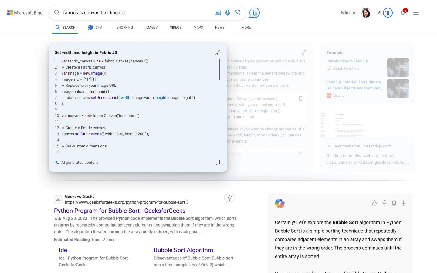
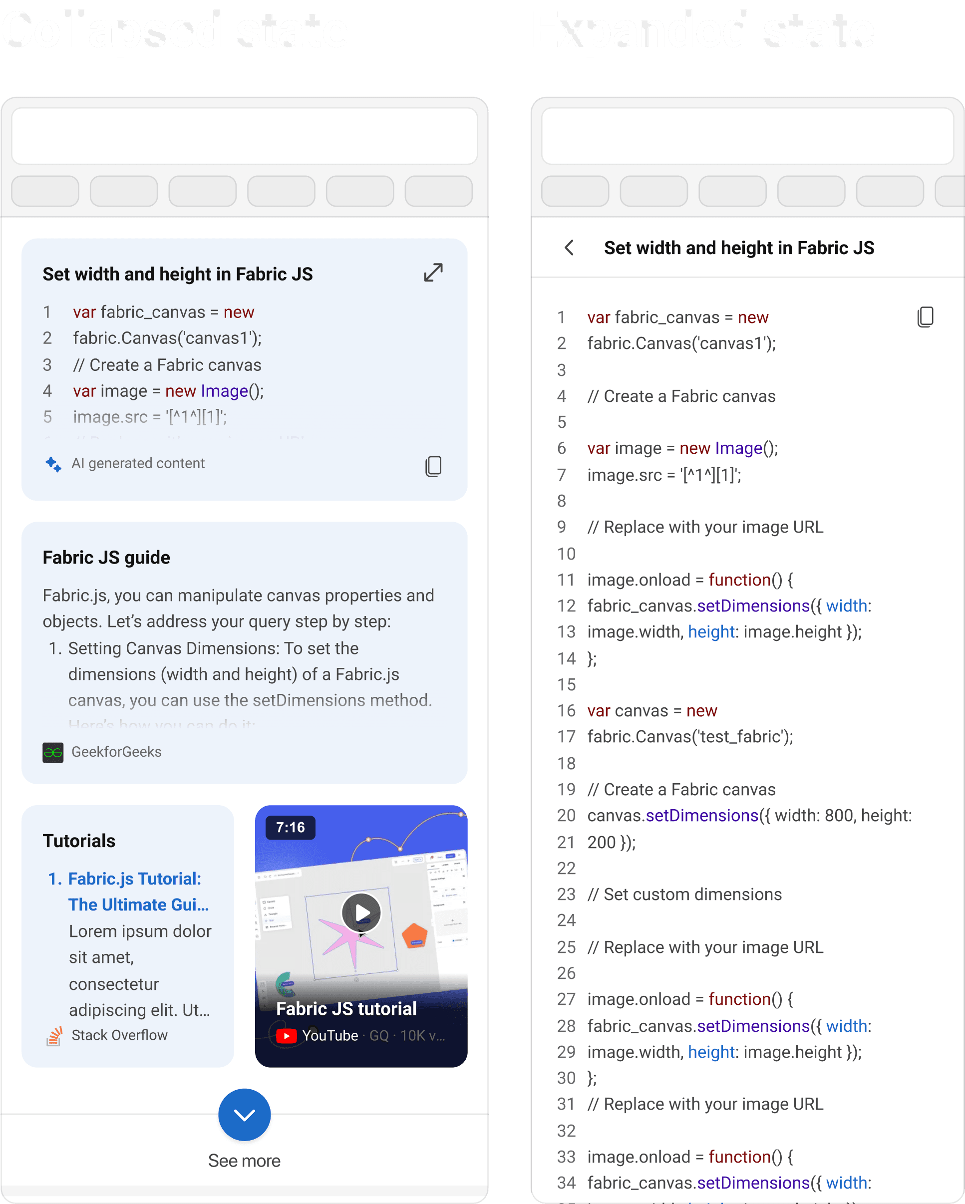
Expansion - Desktop
As code snippet answer is AI generated and redirection to third party website was not possible hence the module will expand here it self.

Expansion - Mobile
As code snippet answer is AI generated and redirection to third party website was not possible hence the module will expand here it self.
Responsiveness
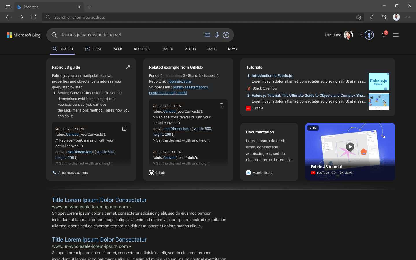
Width 1440px
Magazine answer is build on 11 col grid.
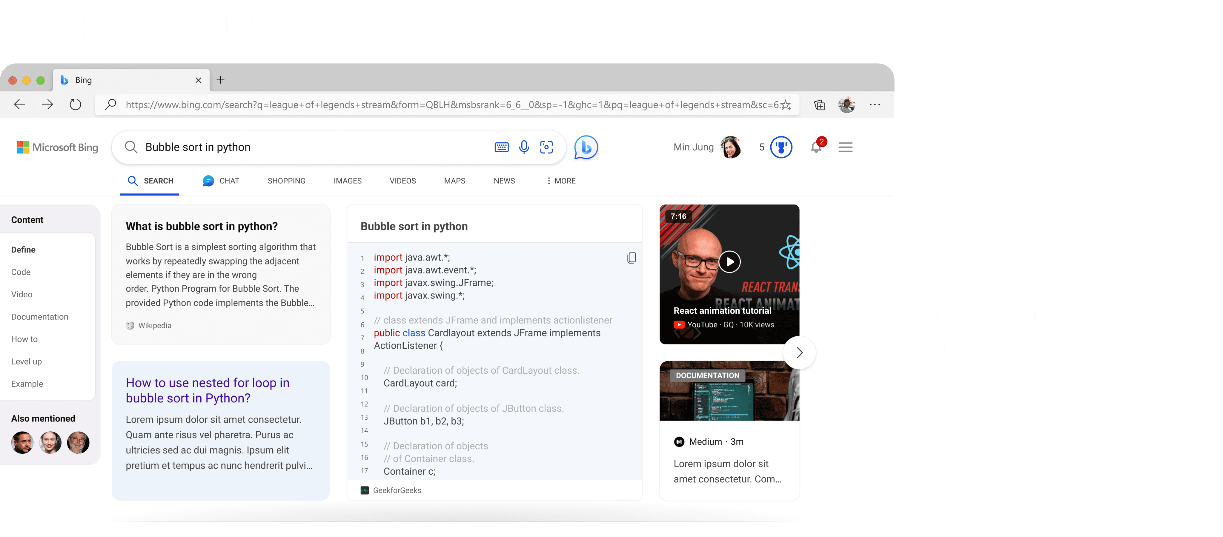
Width 1280px
On width reduce, extra content get clipped and chevron appears on right to navigate. As well as content card appear on left side gutter to quickly navigate to required section.
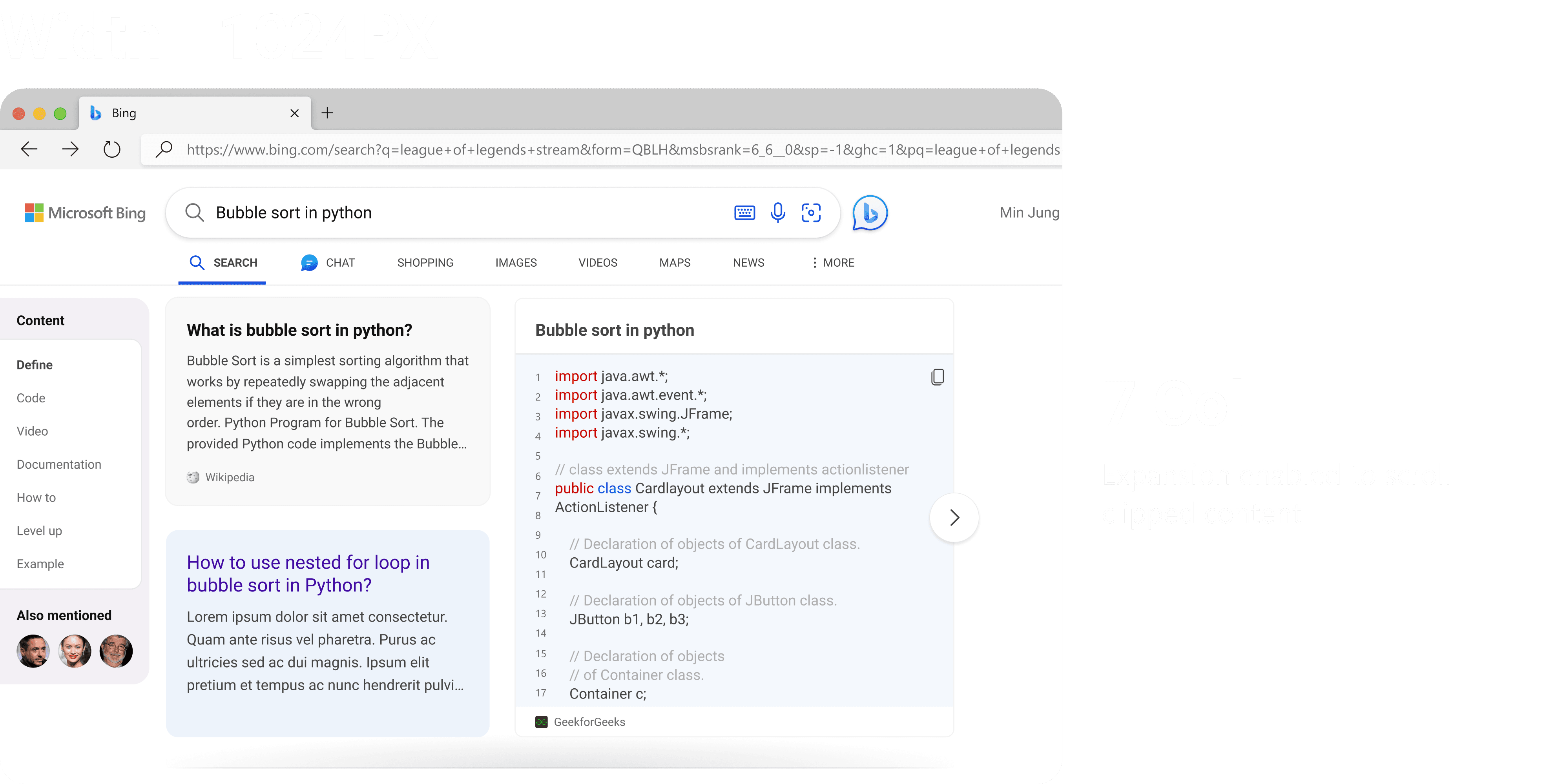
Width 1024px
On width reduce, extra content get clipped and chevron appears on right to navigate. As well as content card appear on left side gutter to quickly navigate to required section.
Modular modules
As magazine answer is laid down in grid format, there are multiple usecases of some content of modules not fit for a certain size, these adaptive sizes help magazine answer fill the space perfectly.

Usability Testing - UX Labs
New Experience (A) Vs Existing (B)
Comparison between existing vs new magazine experience, Users value the diverse resources offered by Magazine, including guides, tutorials, live projects, documentation, and code snippets. These resources facilitate easier and more effective learning and application of the concept. They find it more attractive, organized, clear, and easy to navigate. They loved the direct and specific answer provided to the query, which helps them save time and effort in searching for relevant information.
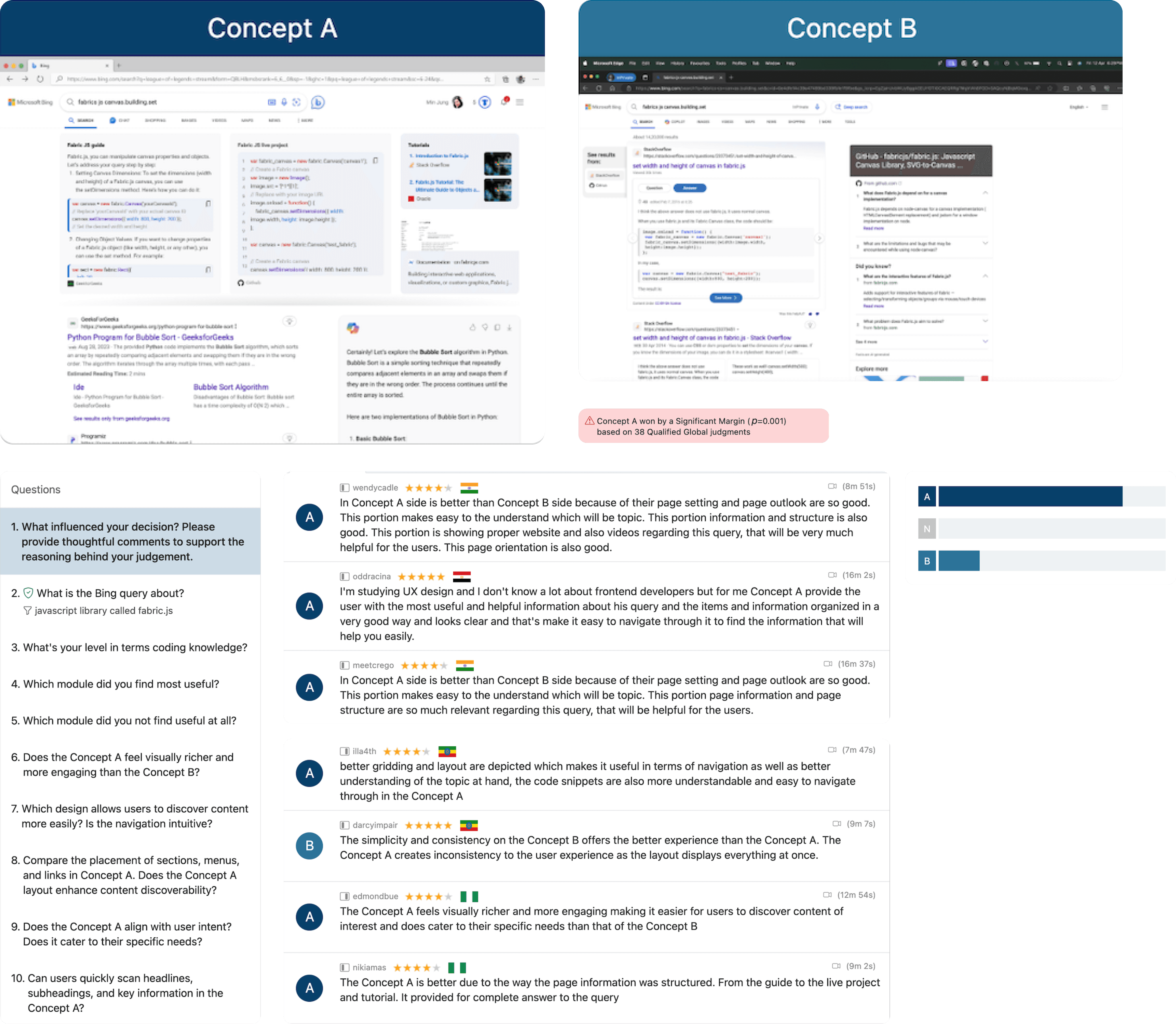
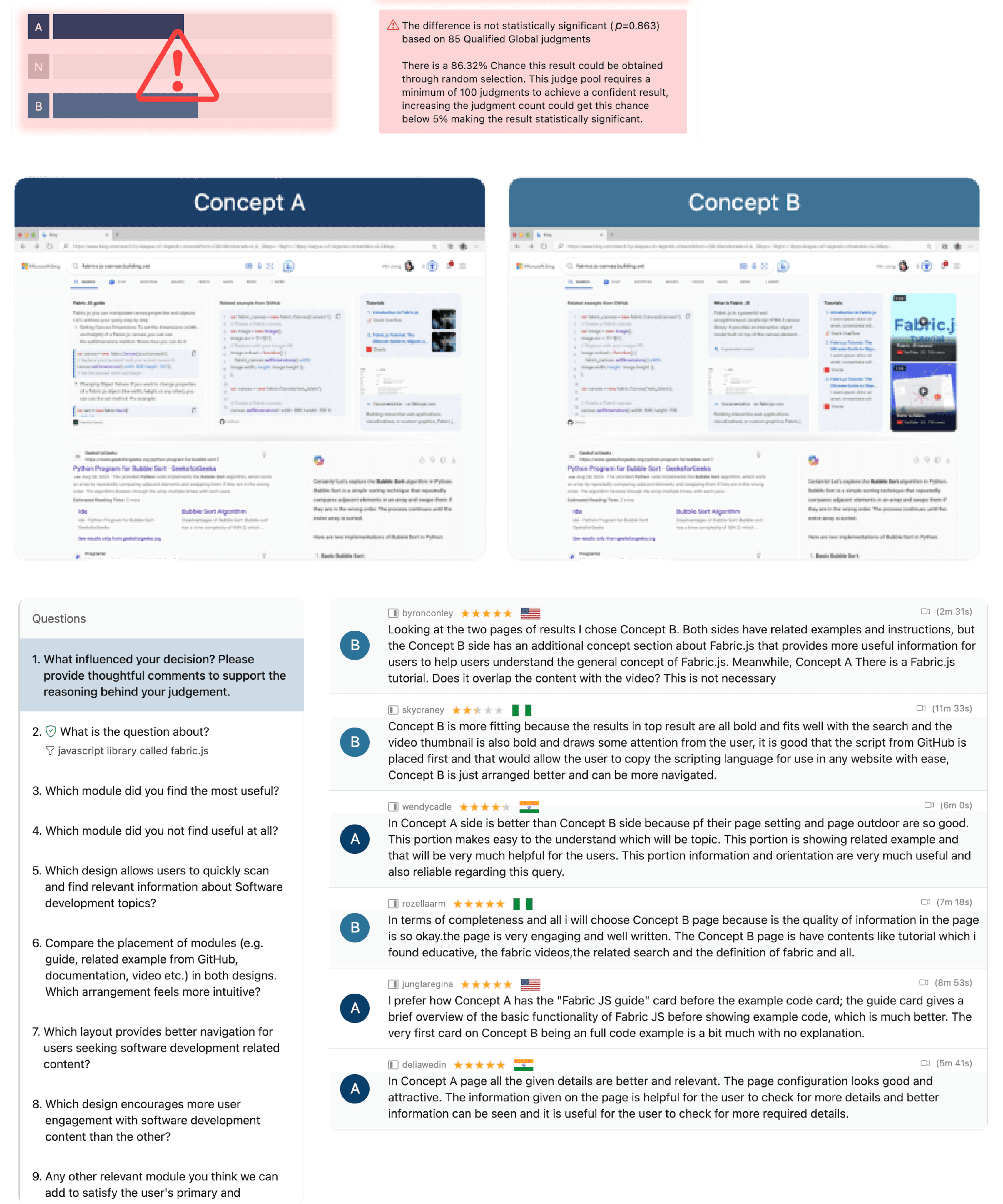
Layout 1 (A) Vs Layout 2 (B)
We created two different layouts for “Intermediate Documentation/API help - fabrics js canvas.building.set” query type, where users liked the guided instructions, code snippet and more of video tutorials. Based on their feedback, we recommend going with this layout and modules to fulfill the user’s primary and as well as secondary intent.
No limit
Improved visual design with no restriction by business goal or design system.

KEY LEARNINGS
Working on this project has been an eye-opener for me. I’ve really honed my user-centered design skills by diving deep into understanding developers' pain points and needs. Integrating diverse content sources into a single, seamless platform has taught me the complexities of creating a unified user experience. Adding multimedia elements to boost engagement has been a fun challenge and has shown me how effective these tools can be for learning. Ensuring consistency and accessibility across devices has become second nature, as has collaborating closely with cross-functional teams. And embracing iterative design has shown me the power of refining my work based on user feedback.


MY ROLE
Responsible for research, usability testing, concept and delivery of key modules and feature areas.
MY TEAM
1 Designers, 1 Product Managers and 3+ Software Engineers.
TIMELINE
Feb 2024 - May 2024