
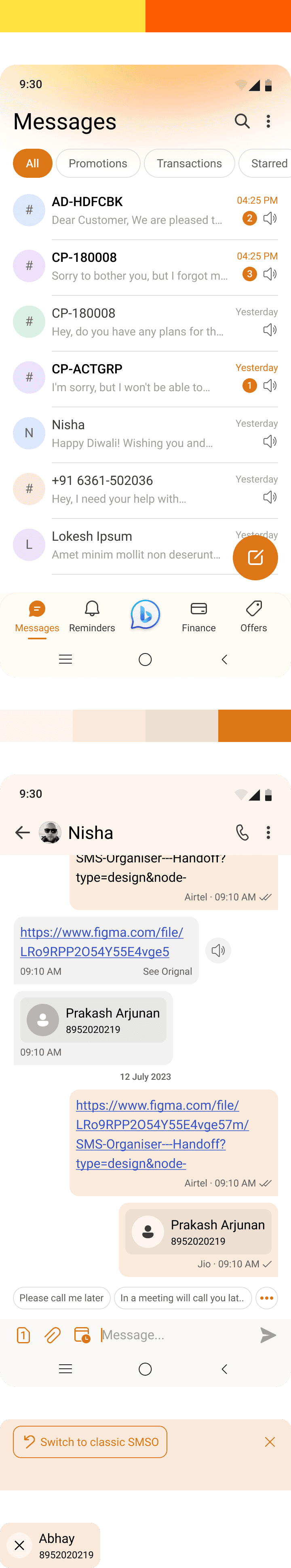
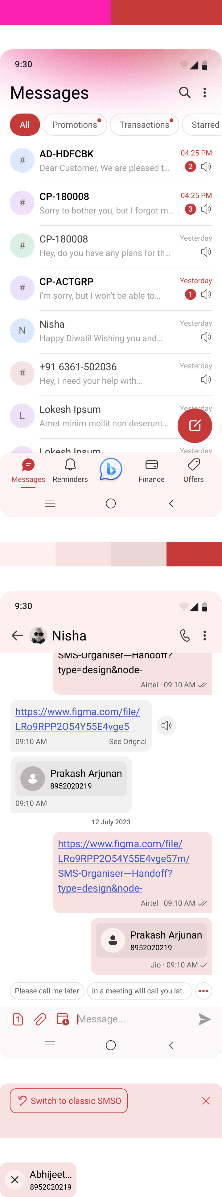
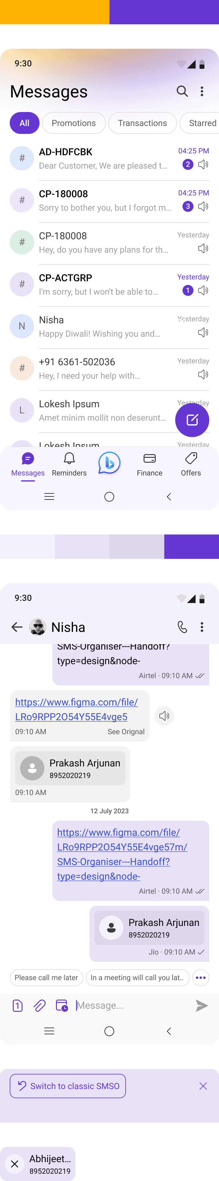
SMS Organizer App Revamp
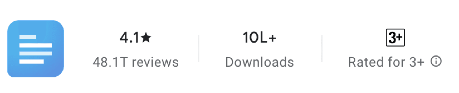
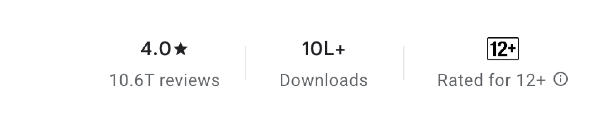
One of India's most widely utilised Microsoft Mobile Applications with 1Million+ Downloads.
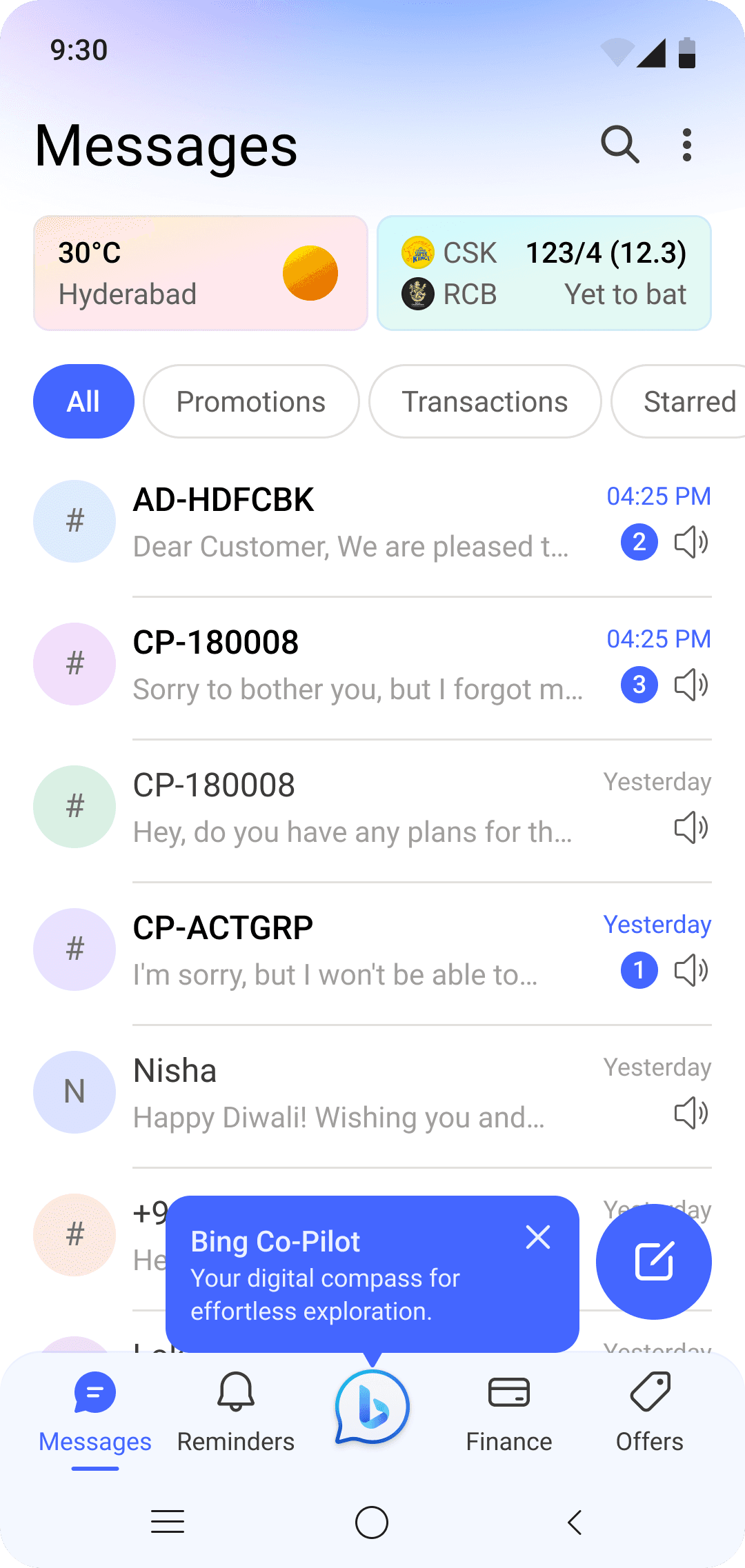
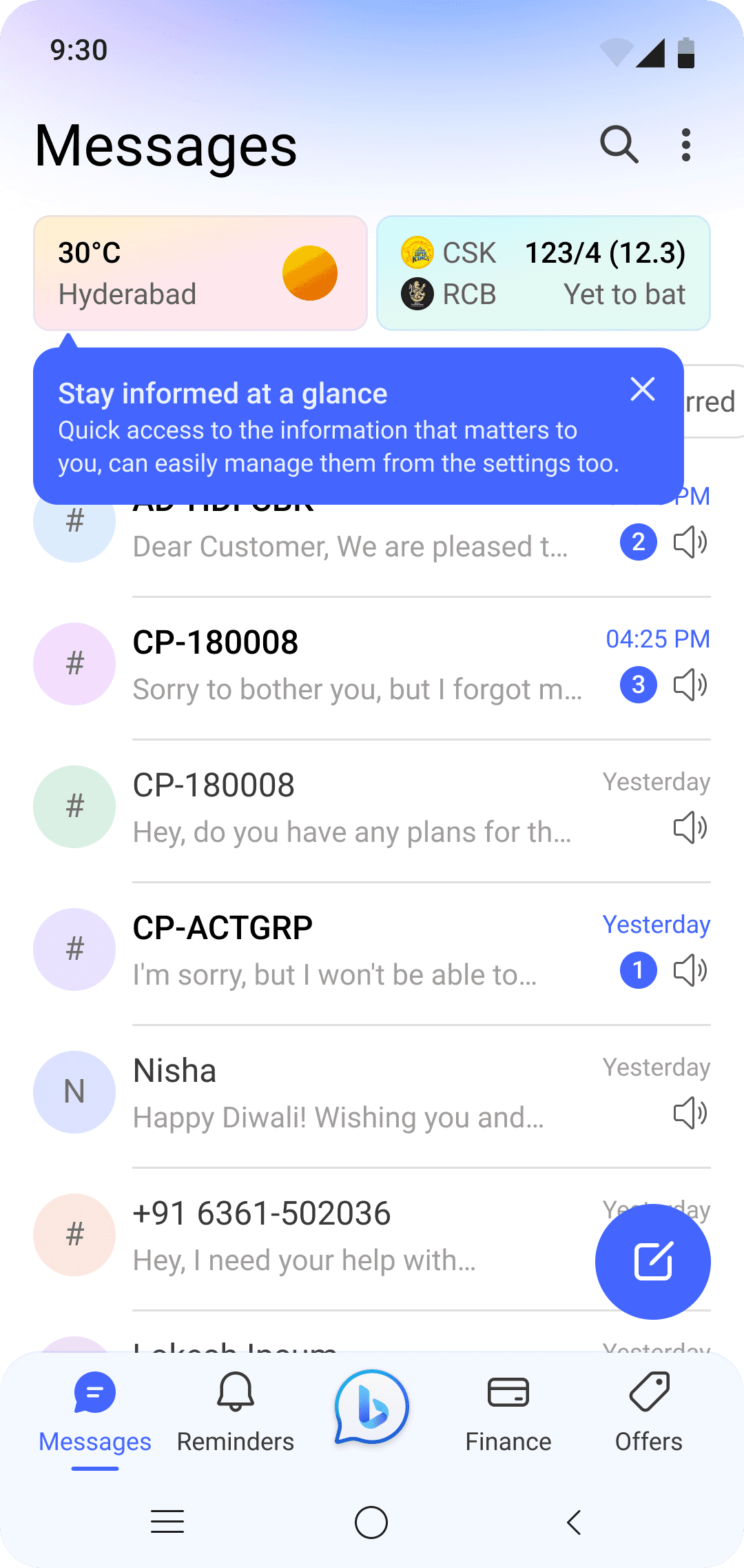
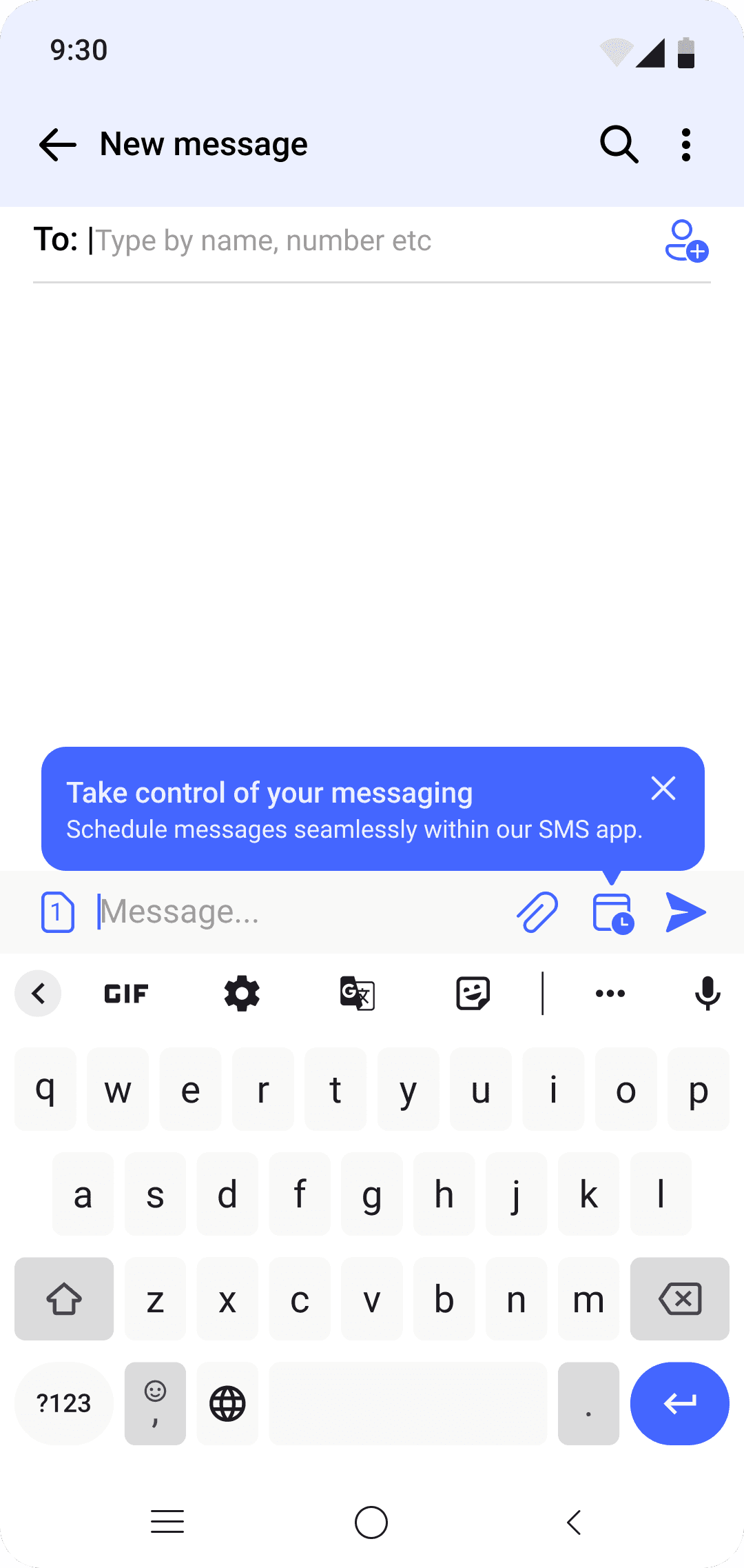
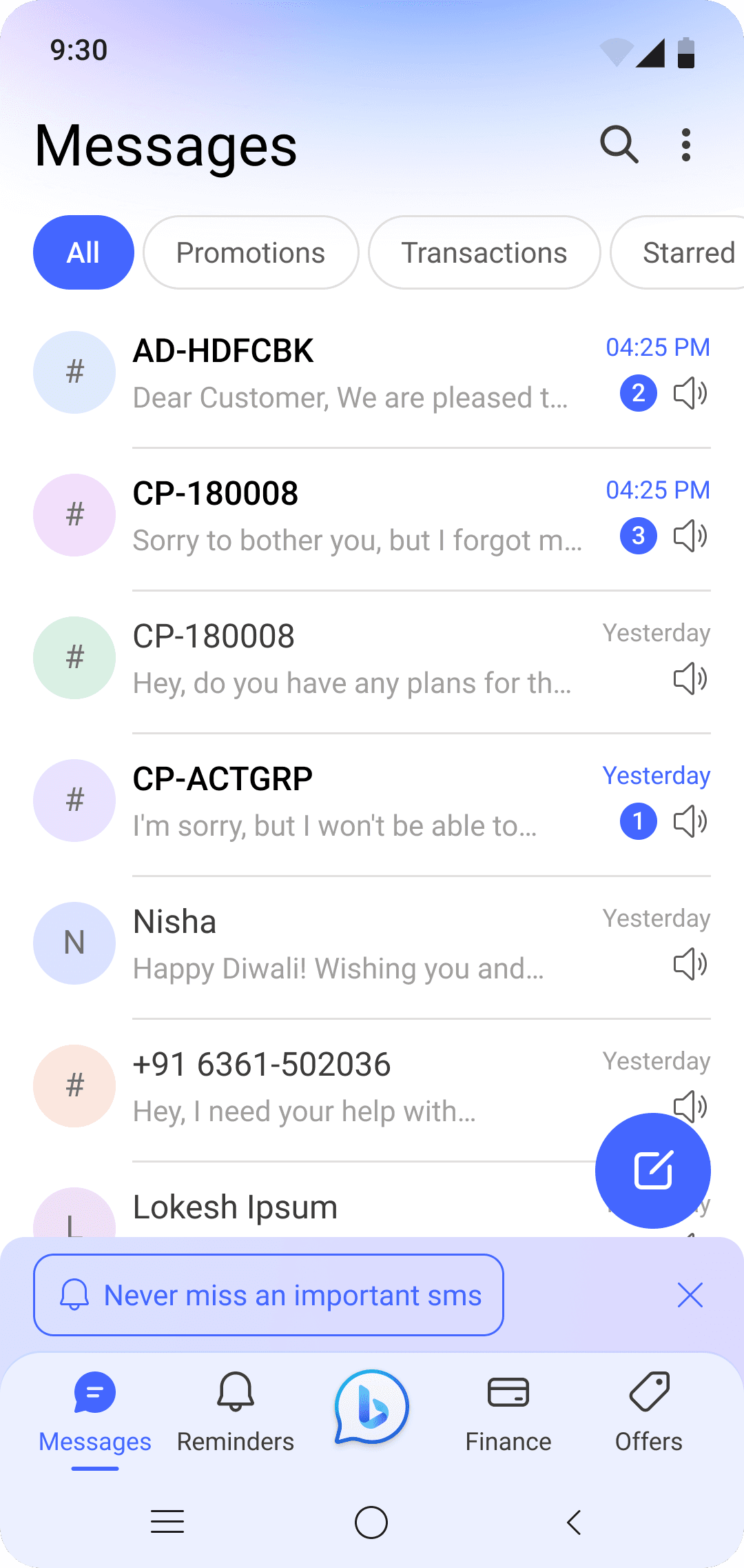
Overview of App


Design principles used while designing
Poportion
Sleek
Balance
Contrast
Emphasis
Why revamp?
USERS
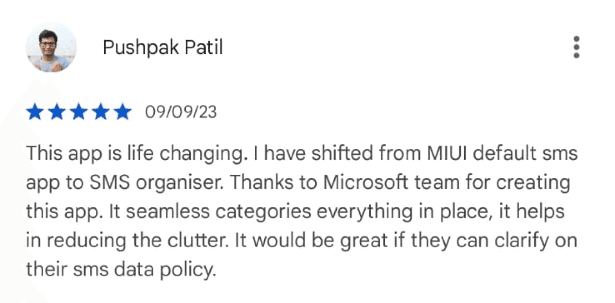
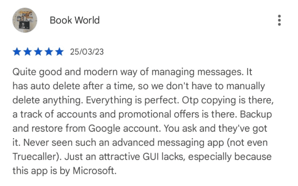
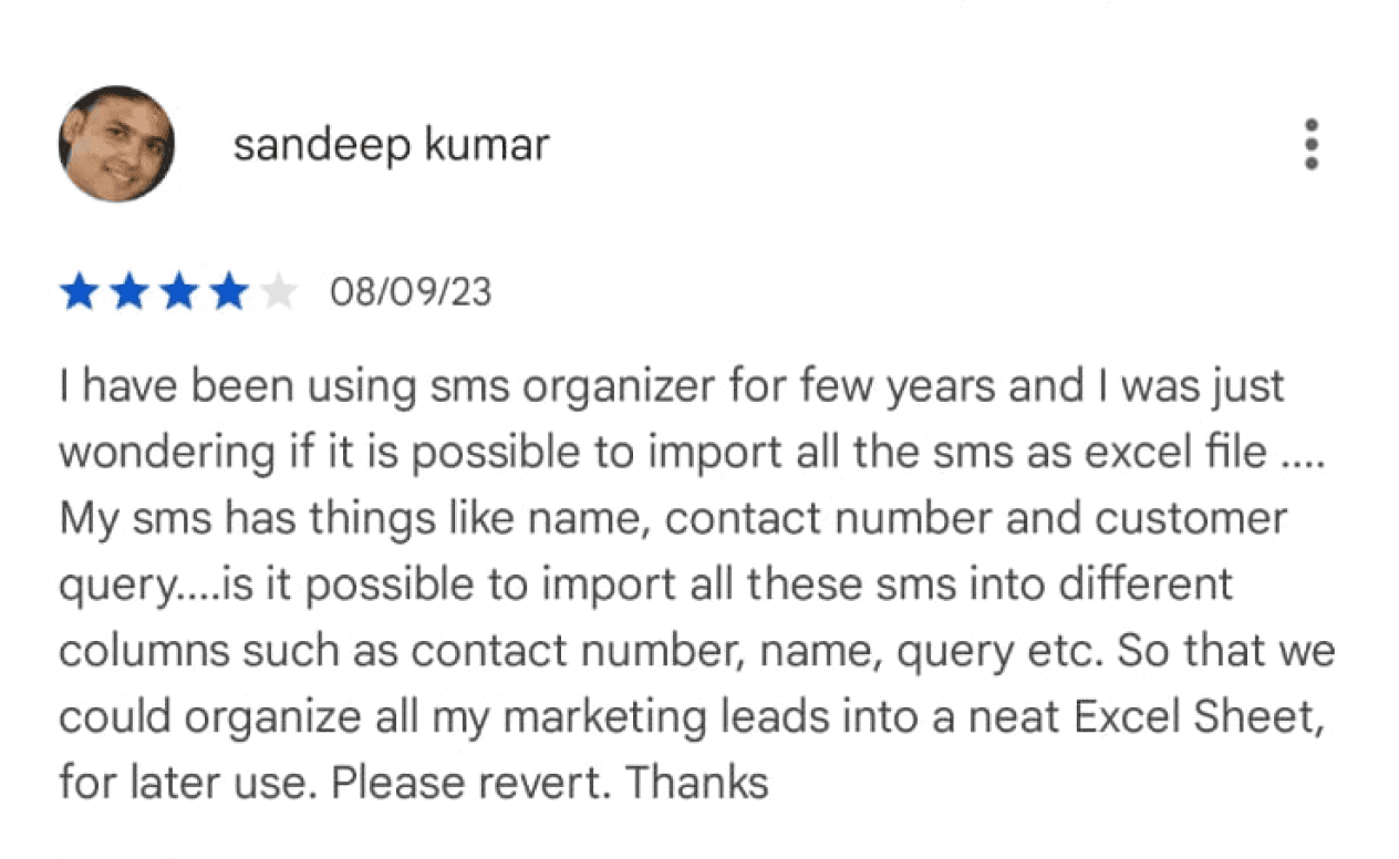
Users have been consistently demanding for upgrades with the features and to improve the look and feel of the APP.

USERS
Users have been consistently demanding for upgrades with the features and to improve the look and feel of the APP.


From
Focus on the SMS important to you with SMS Organizer.
To
A new SMS organiser that helps you sort out your Important SMS, with a refreshed look, increased efficiency and with inclusive capabilities making it more accessible to a wider audience.
User problems

SUGGESTION
Need functionality to view sms in full screen, to improve readability.
Preserve toggle on/off unread messages.
Select and copy specific part of message.
Should be able to disable all the unused tabs.
OPPORTUNITIES
The app's user interface is confusing and difficult to navigate, especially for new users.
Fixing accessibility issues like readability.
Better use of iconography & illustration to make the app more comprehensible.
Adapting modern market UI trends.
Use of vibrant colors and trending themes to personalize.
Use of micro-animations to give more better feedback and response to the user.
KEY PROBLEMS
Confusing interface
Readability issue
Reminders not useful
No multi language support
Lack of feedback
Modern theme and colors
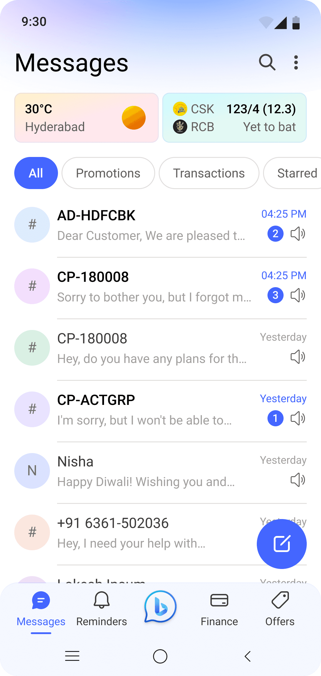
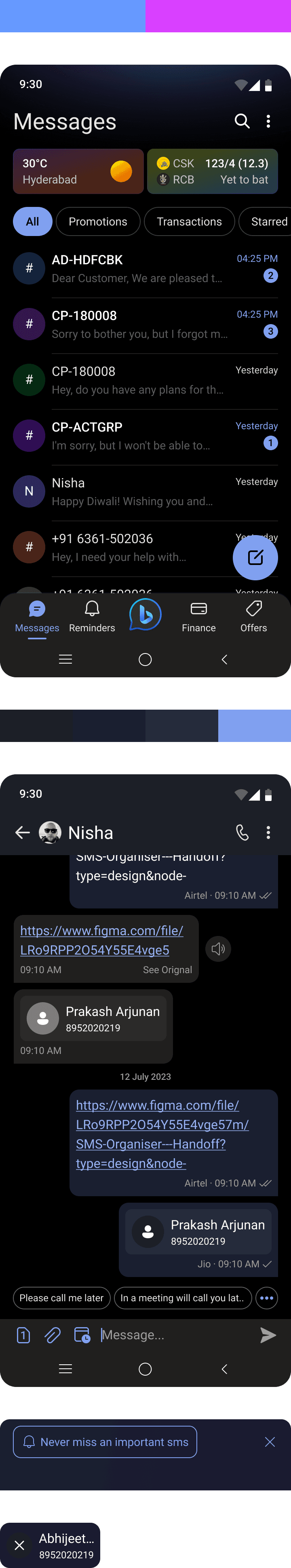
#1 Confusing interface
PROBLEM STATEMENT
Users experienced confusion while navigating the app, primarily due to the presence of two separate navigation systems, which made interactions unclear. Additionally, issues with spacing and font size contributed to increased cognitive load, further complicating the user experience.
SOLUTION
Switching the navigation
We moved the primary navigation from top to bottom as that is industry standard familiarity and close to thumb.
We clearly distinguished visually the primary navigation bar and secondary intent.
We called out bold which page they are on.

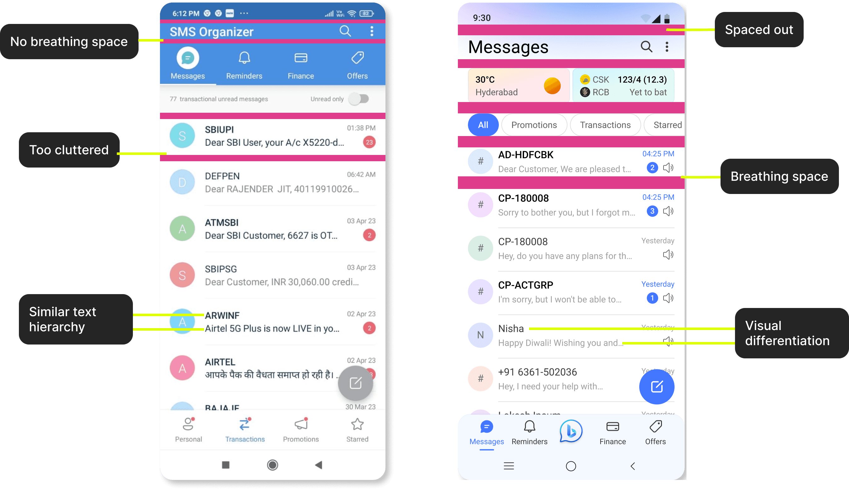
Better spacing and hierarchy
We increased the breathing space between elements and spaced out a bit.
Enhanced visual hierarchy.
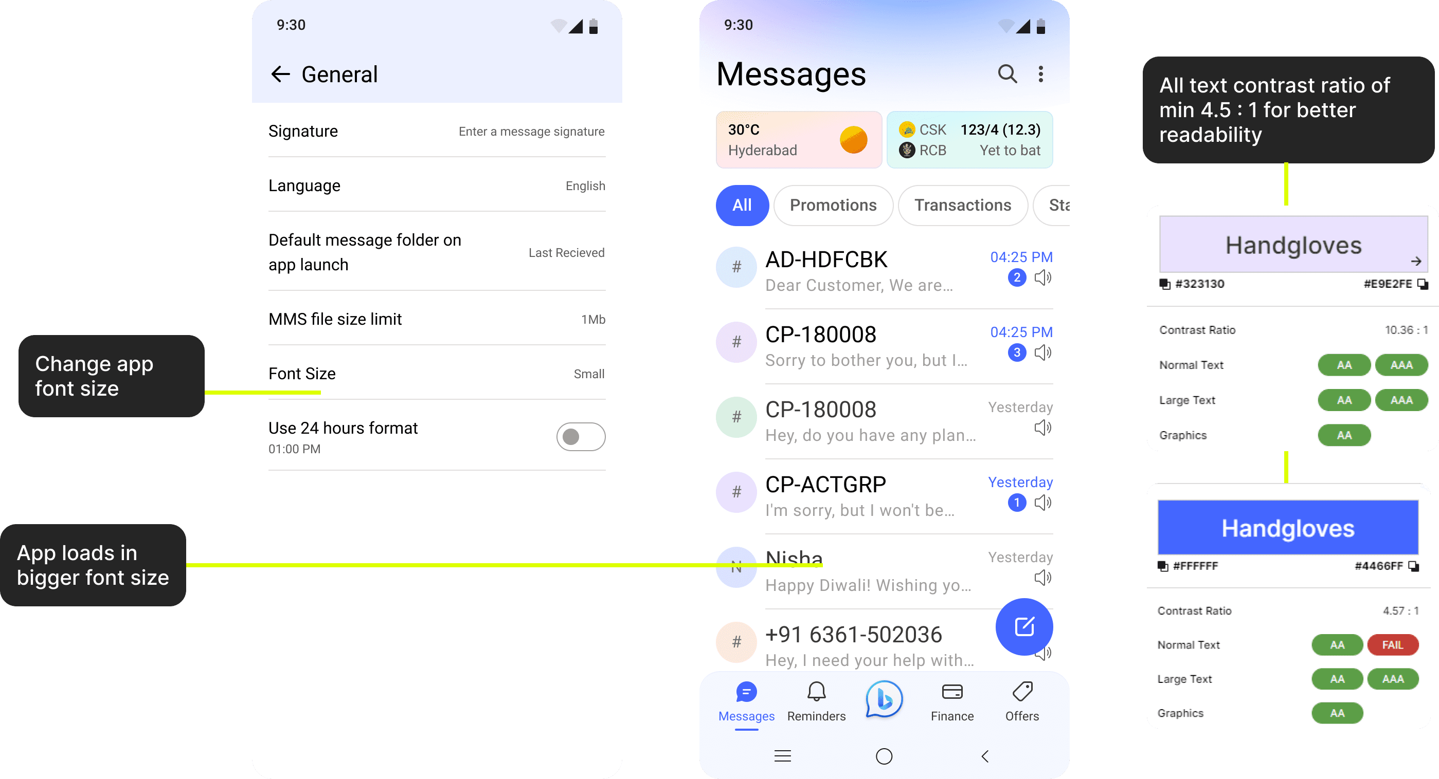
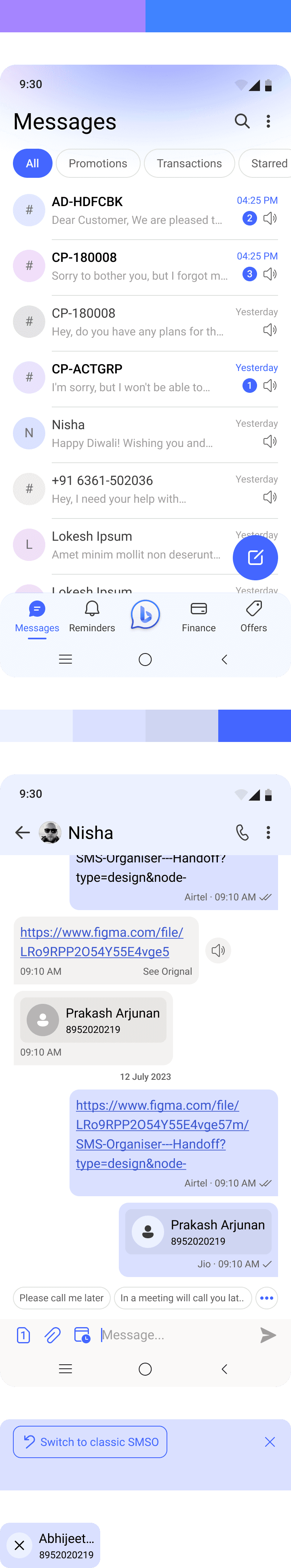
#2 Readability issue
PROBLEM STATEMENT
Users are experiencing significant readability issues within the app due to text that is too small and lacks sufficient contrast. This not only hampers their ability to read content comfortably but also creates accessibility challenges, making the app difficult to use for individuals with visual impairments.
SOLUTION
Higher contrast and font sizes
App supports different font sizes from small to large to cater all users from young to elderly.
All texts passes the contrast check and have a min of 4.5 : 1 contrast ratio.
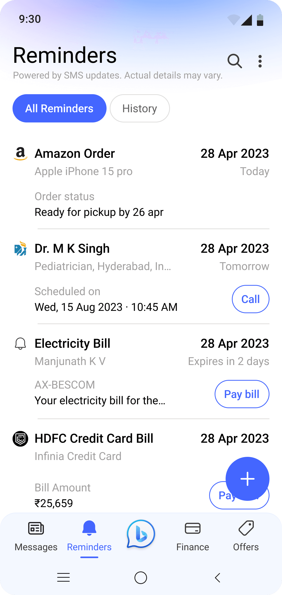
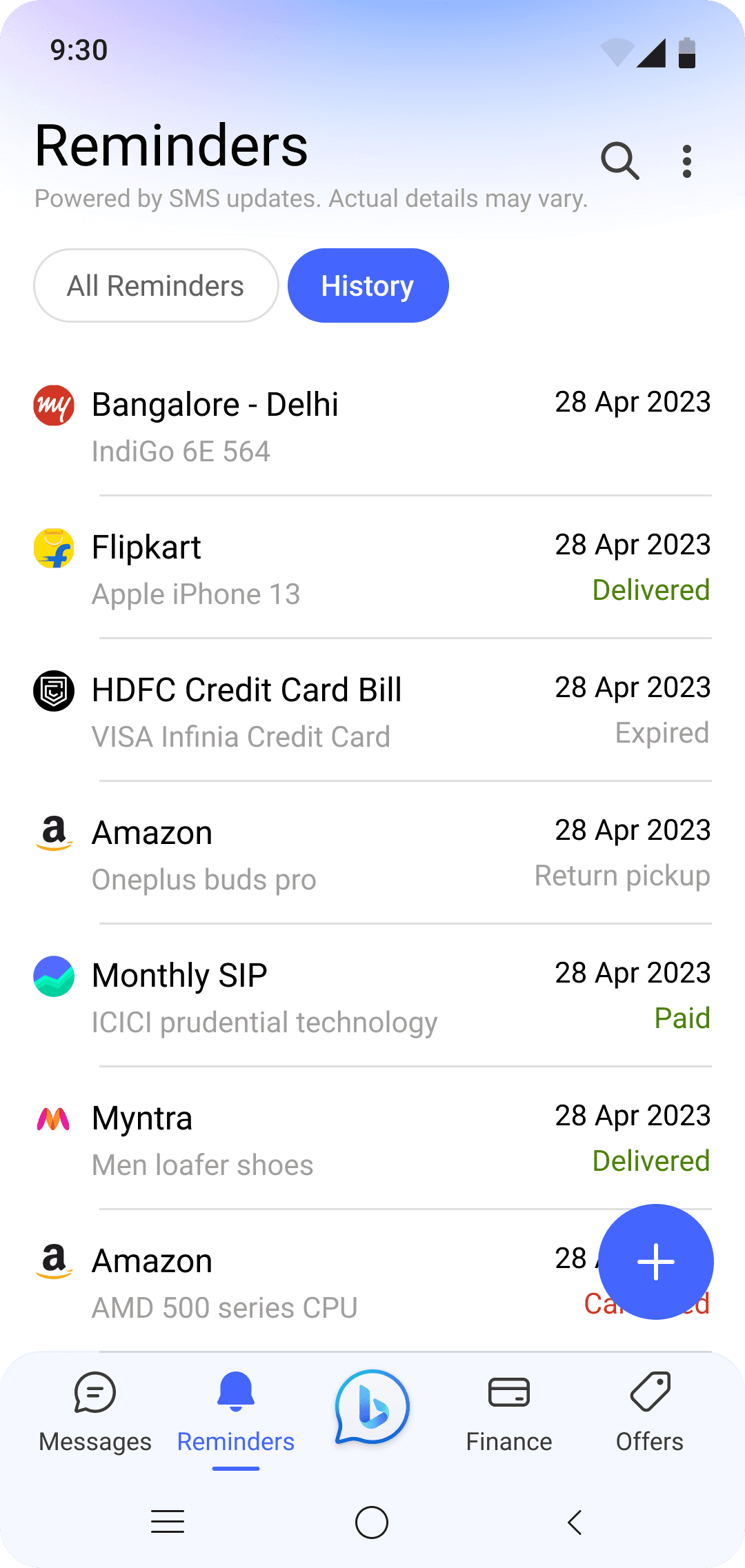
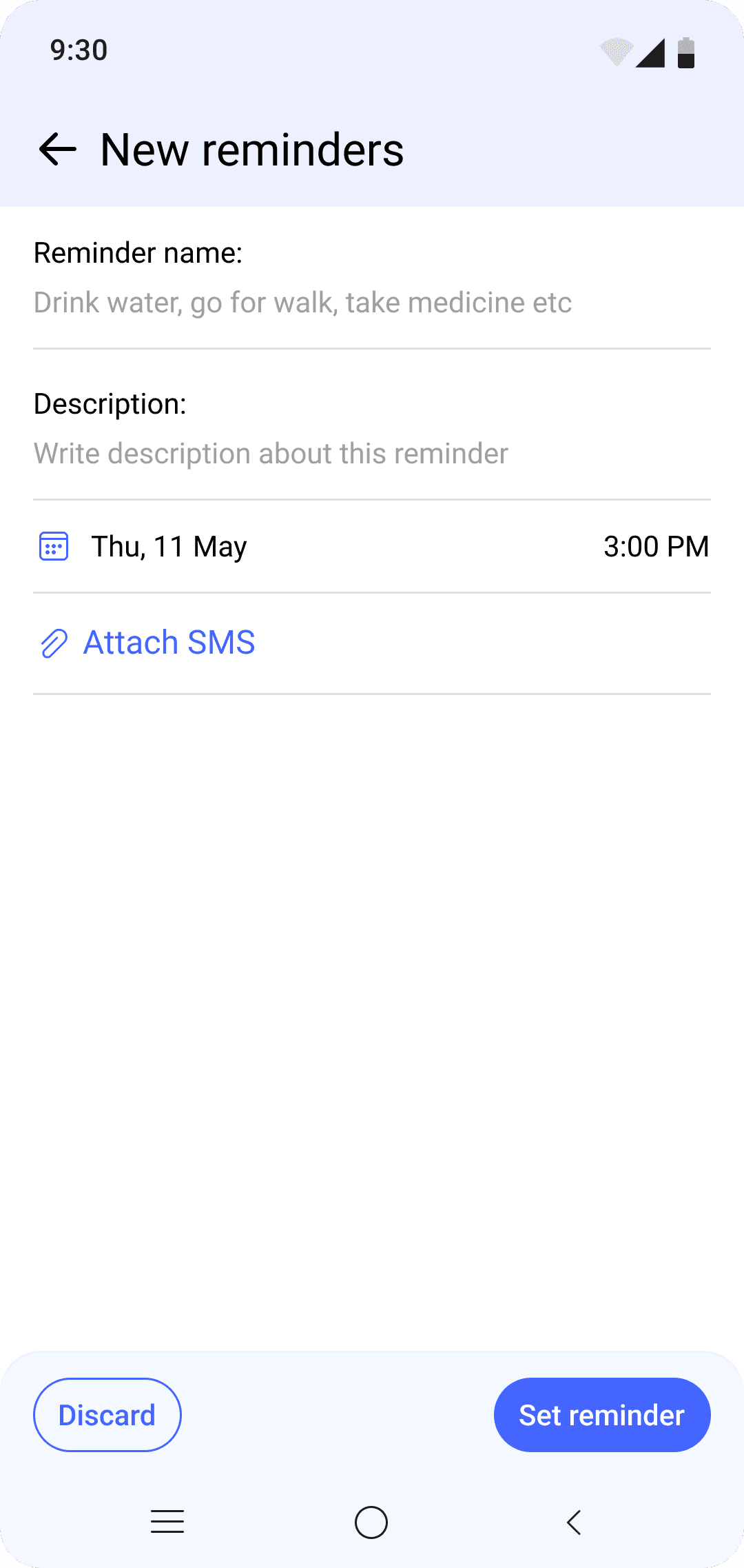
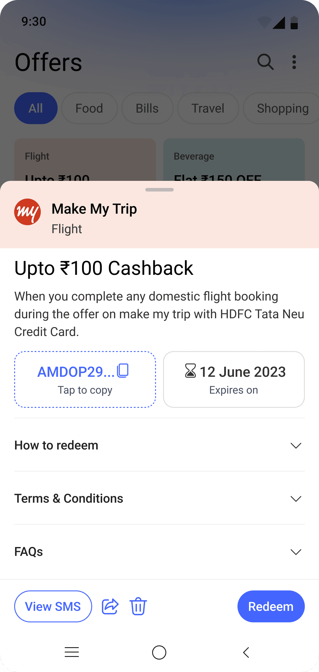
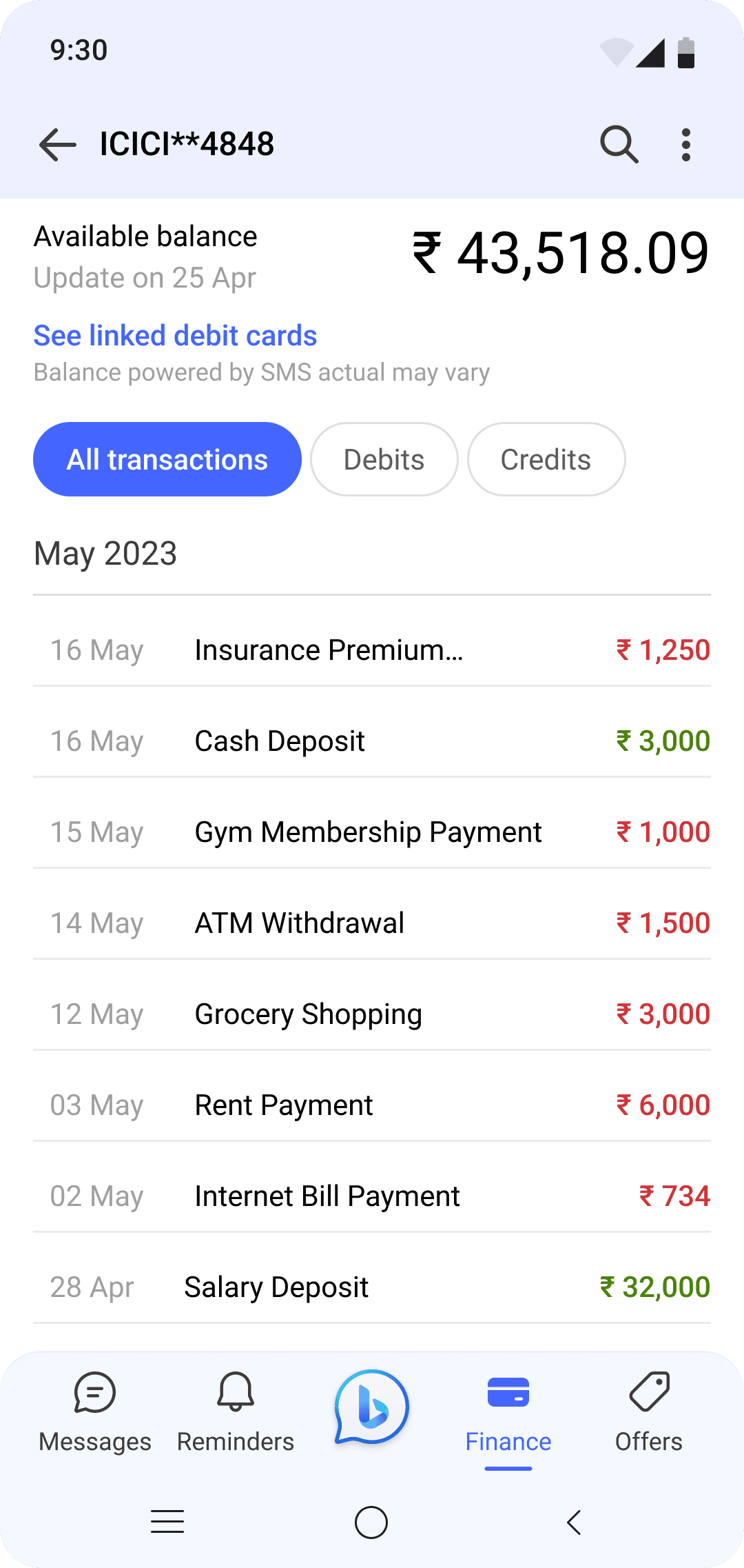
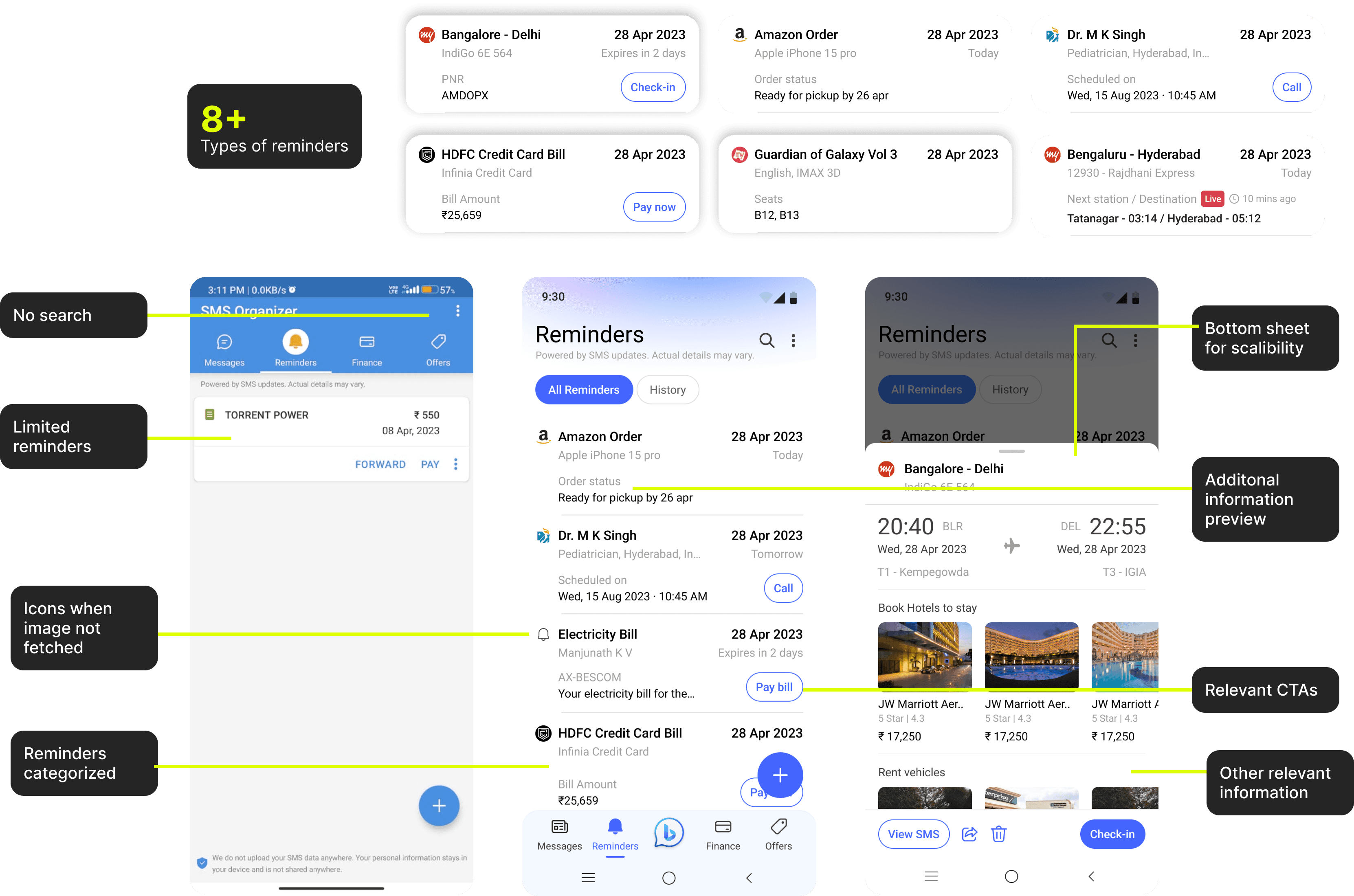
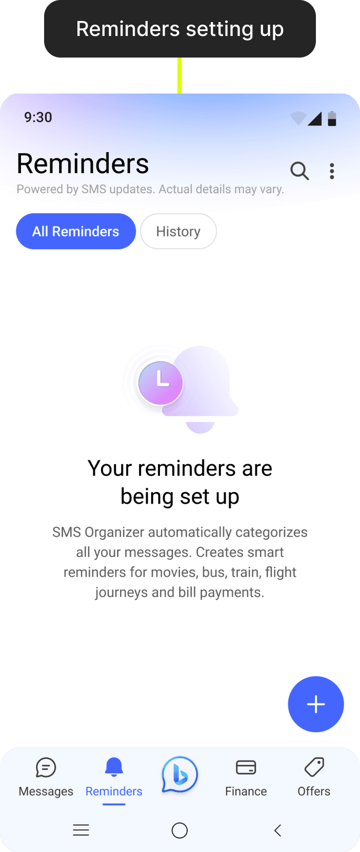
#3 Reminders not useful
PROBLEM STATEMENT
Users desire an app that automates tasks to enhance their convenience and efficiency. They want the app to automatically remind them when their bookings are approaching and enable them to perform related actions directly within the app.
SOLUTION
Smart reminders
All reminders categorized into different categories.
Shows other relevant information.
On click, bottom sheet appears for scalability and can show more relevant info powered by Bing.
Automatic smart reminders for hotel, flight, movie, doctor train and more.
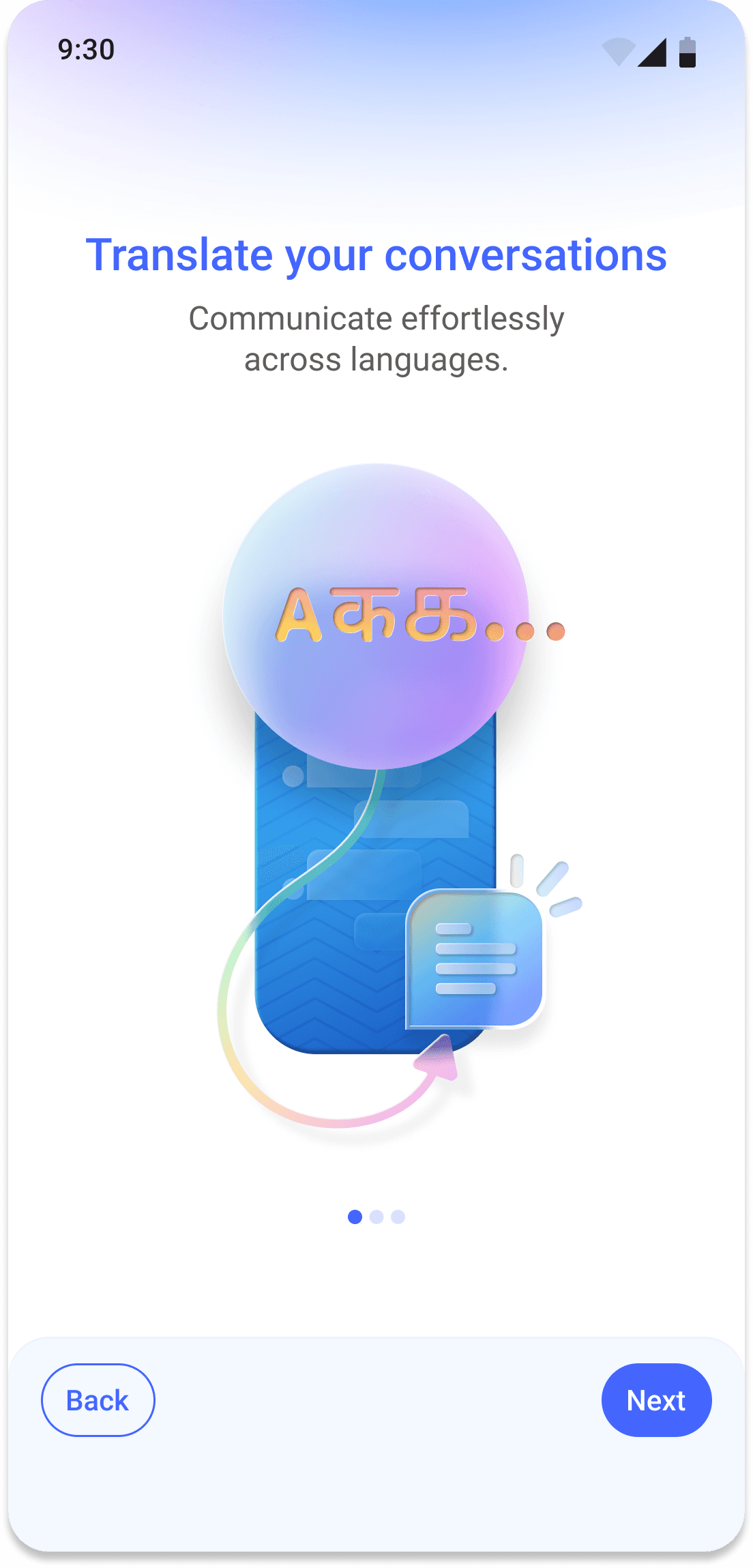
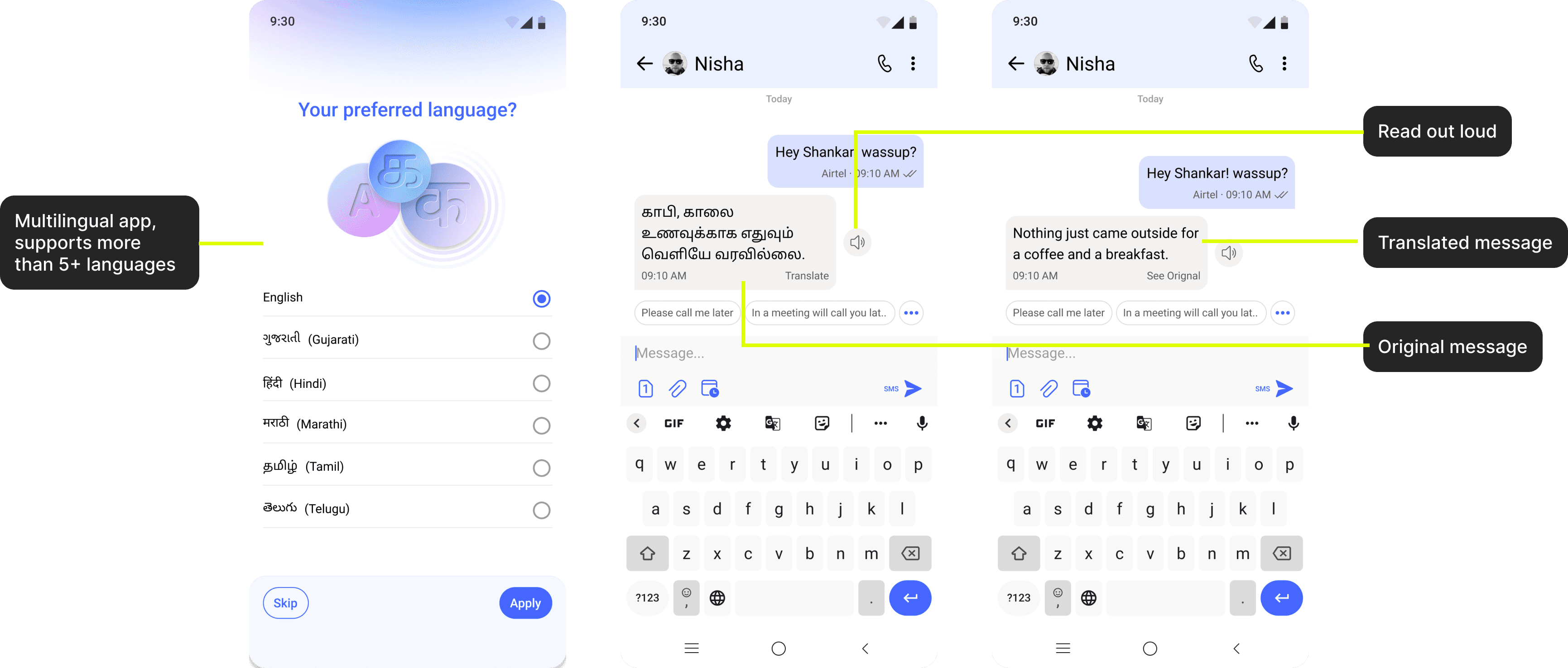
#4 No multi language support
PROBLEM STATEMENT
The app, widely used by Bharat users across India, faces a significant language barrier issue. With over 20 languages spoken in the country, users receive SMS messages in the original language they were written in, without any translation to match the language settings of the app. This lack of translation creates confusion and hinders effective communication, making it difficult for users to fully understand and utilize the app’s features.
SOLUTION
Multilingual app
Supports more than 5+ languages, made for Bharat.
Translate unknown language messages to your known language.
Read out loud messages, hear your message in known language as user might not know how to read but can understand hearing.
#5 Lack of feedback
PROBLEM STATEMENT
The app currently lacks feedback mechanisms for user actions, resulting in a dull interaction experience and leaving users uncertain about the outcomes of their actions. This absence of feedback diminishes user engagement and satisfaction, as they are not informed about the status or success of their interactions within the app.
SOLUTION
Micro-animations
Created delightful micro-animations for navigation bar. Triggers on click via lottie.
Other interaction across app like swiping, selecting filters, bottom sheet opening etc.
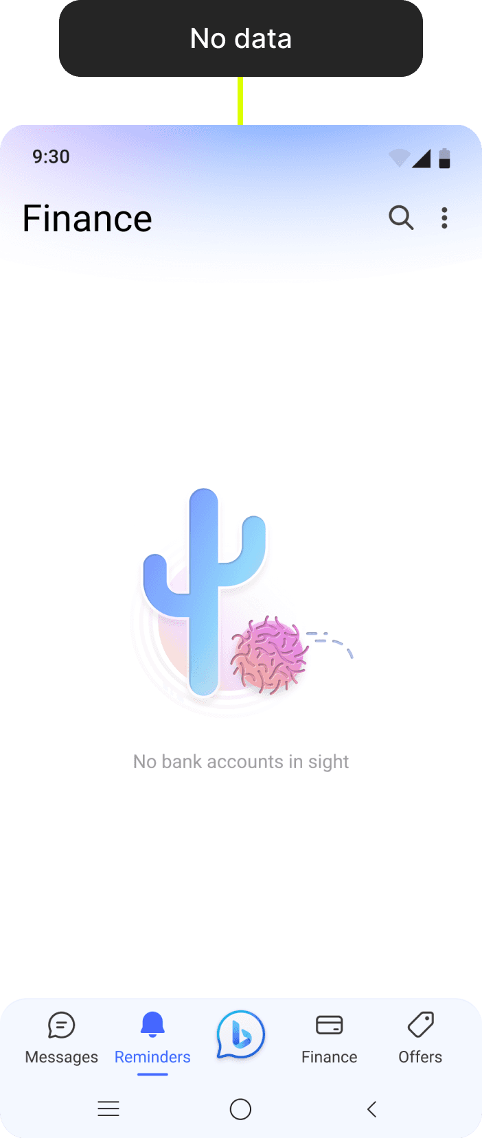

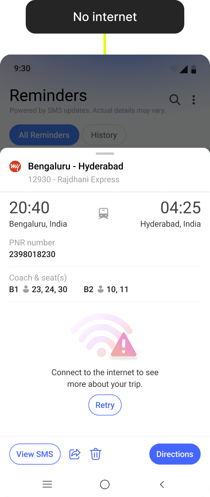

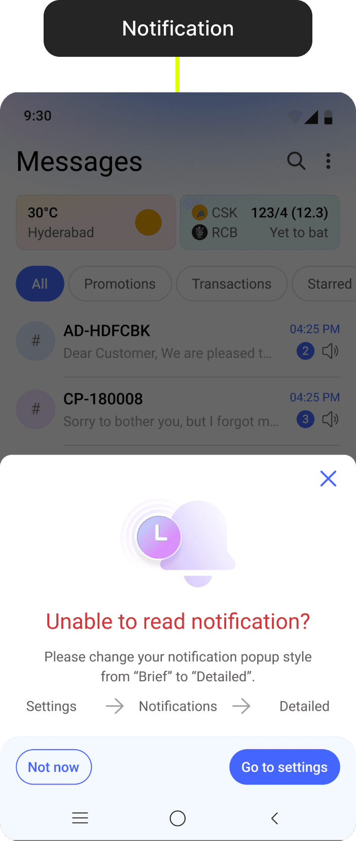
Error handling and road bumps
Empty states when there is no data yet.
Error state like no internet or message not delivered etc.
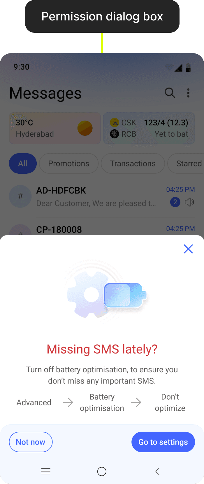
Dialog boxes for system permissions.
FREs
Create multiple first run experiences to showcase the new features of the app to the users.
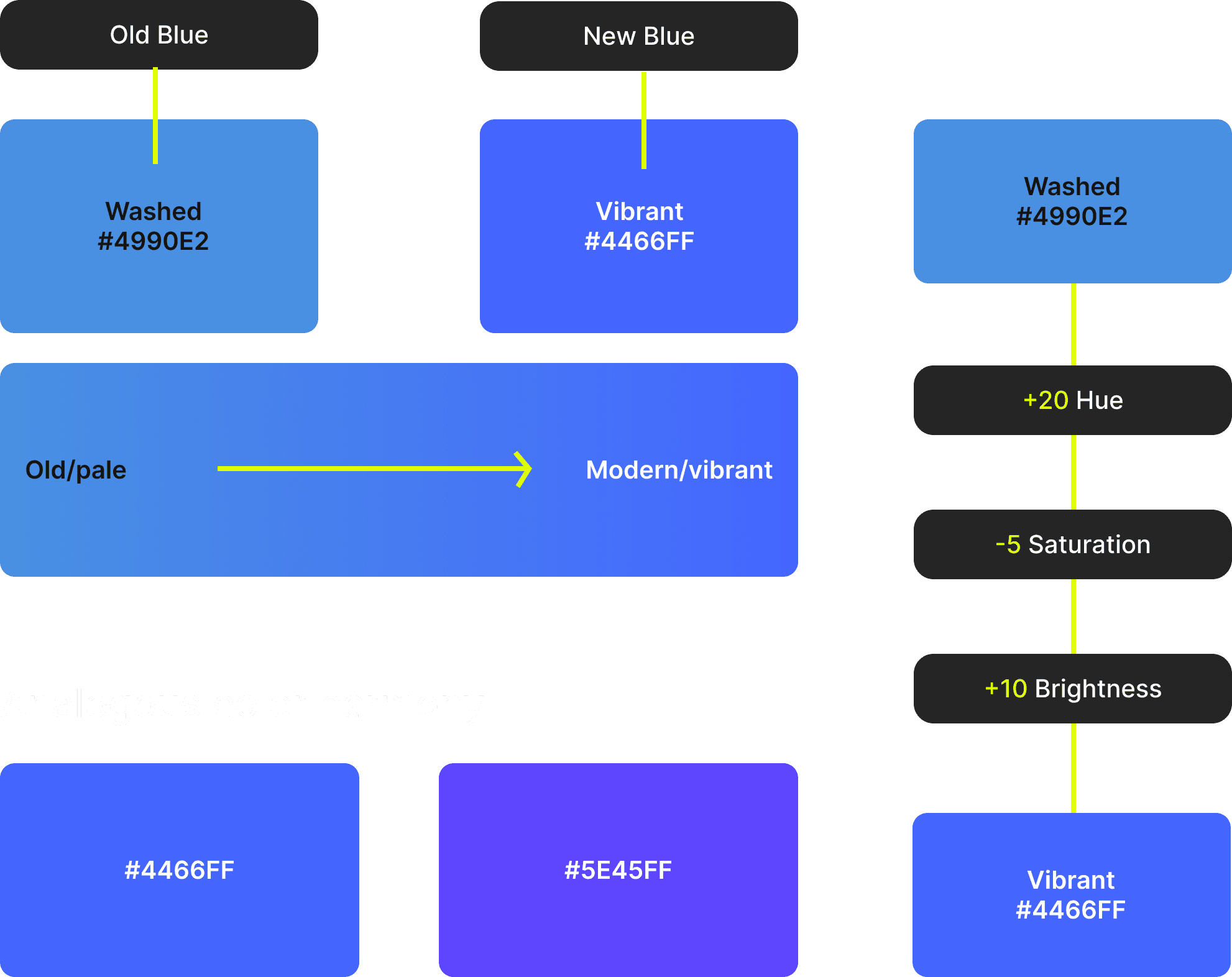
#6 Modern theme and colors
PROBLEM STATEMENT
The app, lacks moderns UI interface and features like themes, bubble chat, customization etc.
SOLUTION
Updating colors
We updated our old blue to vibrant and modern blue color.
We used analogous color theory to define the overall colors of the app.

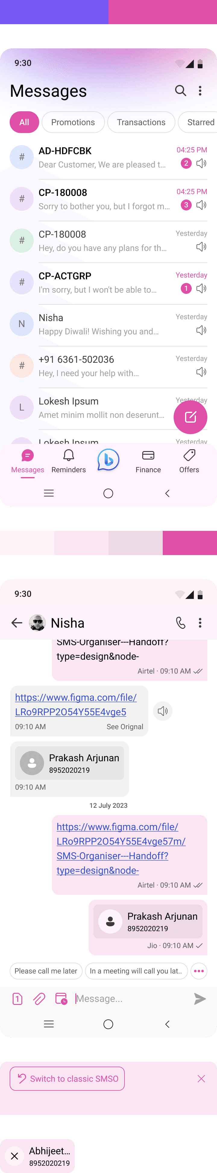
Themes
Created 8+ themes to give personalization to the user to select their own style
User Journey

Usability Testing - UX Labs
New Experience (A) Vs Existing (B)
Comparison between existing vs new magazine experience, Users value the layout and presentation of concept A more than B. They prefer modern and attractive UI of concept A.

KEY LEARNINGS
During this project, I gained valuable insights into design scalability. I focused on creating a design that accommodates language translations without compromising the layout. By developing a design system using Material 3 for the Android app, I ensured consistency and adaptability. Given that this is an existing app, I also strategized on how to roll out the new design to both new and existing users in phases, to prevent any abrupt changes and ensure a smooth transition.


MY ROLE
Responsible for research, compettive analysis, app audit, design system, user testing and delivery of key modules and feature areas.
MY TEAM
3 Designers, 1 Product Managers and 4+ Software Engineers.
TIMELINE
April 2023 - October 2023